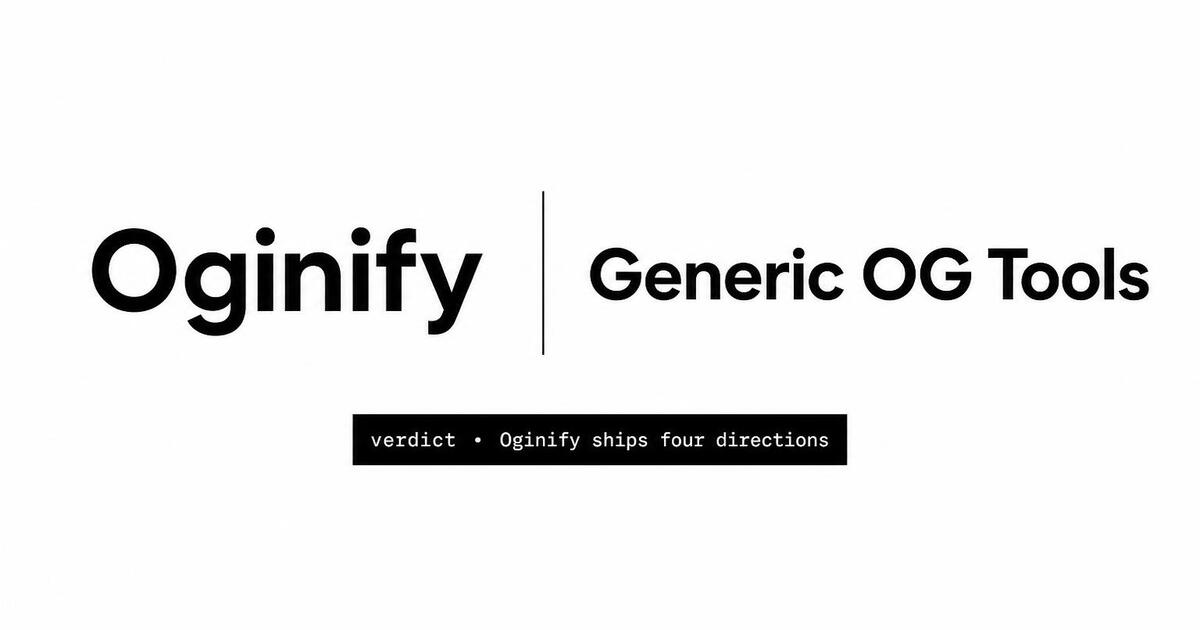
OG Images Generator for Comparison Pages
Comparison and 'X vs Y' pages are the highest-converting content surface most sites have — and they live or die on the share. Generate a card that puts both wordmarks and the verdict on the unfurl, so the link wins the click in any thread.
Why Choose Oginify
Built for selection-intent pages that reach an audience already choosing between two products — the card needs to look authoritative the moment it unfurls.
Both Wordmarks on the Card
Oginify reads both products from the page and renders both wordmarks side by side with a 'vs' divider. The recipient sees the matchup before they click — the card is the headline, not the URL slug.
Optional Verdict Chip
If your page has a clear recommendation ('better for teams', 'better for solo devs'), Oginify surfaces it as a chip on the card. The reader sees the verdict and decides whether they need the rest of the post — better-qualified clicks, higher time-on-page.
Roundups & Buyer's Guides
The same engine renders a 3-logo or 4-logo card for 'alternatives' roundups and buyer's guides. The grid auto-balances so no logo dominates by accident — the card reads as research, not a hatchet job.
Validate Before You Ship
Comparison links spread fast — a logo that renders wrong on LinkedIn is a brand problem you can't recall. The built-in validator confirms both wordmarks and the verdict chip render correctly across every major platform first.
Refreshes on Competitor Updates
When the competitor ships a feature that invalidates a row in your table, edit the page and re-run Oginify. The card updates and the share in last quarter's thread unfurls with the fresh verdict next time someone clicks.
Per-Comparison, at Scale
If you maintain a /comparison/{slug} matrix with dozens of vs pages, the Oginify API generates one card per slug. Wire it into your CMS publish flow once and every new comparison ships with a card automatically.
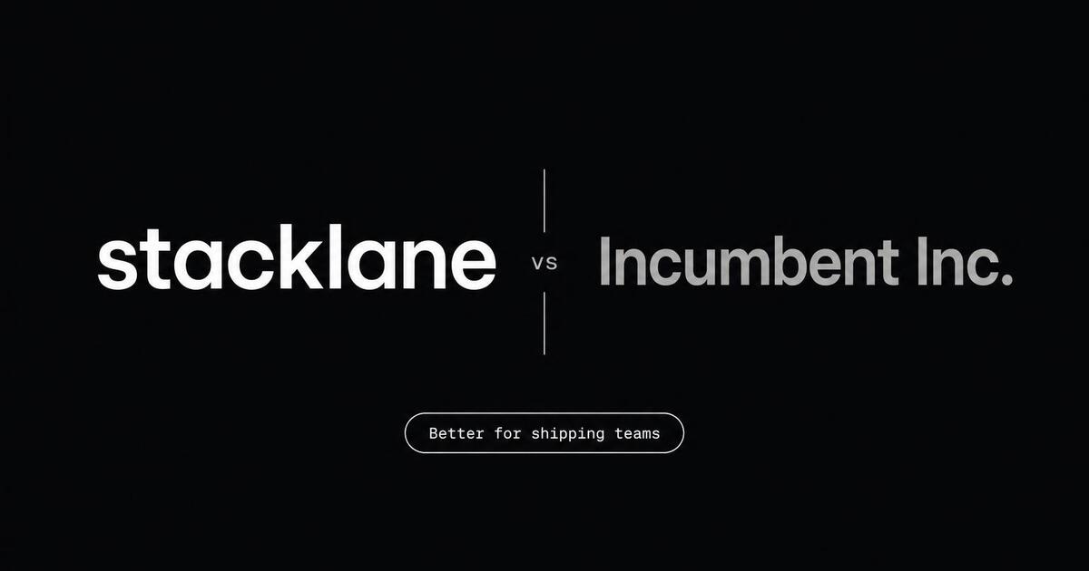
SaaS · stacklane.com
For Comparison on SaaS Sites
A direct head-to-head page can convert at 8% or look like a hatchet job, and the OG card decides which one happens before the prospect reads a single matrix row. Oginify renders both wordmarks at equal weight with a neutral 'vs' divider, plus an optional verdict chip when the page commits to one. The buyer Slack sees a comparison; the competitor's deal doesn't get killed by the unfurl.
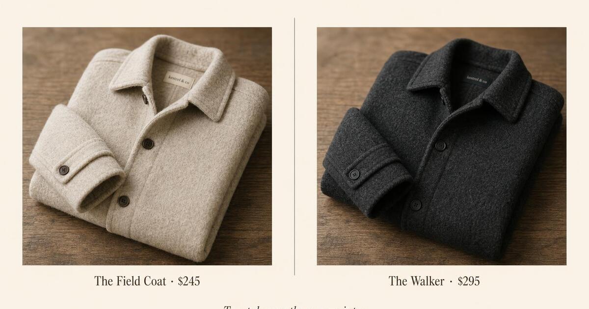
E-commerce · kestrel & co
For Comparison on E-Commerce Sites
DTC comparison pages convert in group chats because of the photo grid — two coats next to each other, three mattress profiles in a row. That's also why the default unfurl tanks: it hides the grid behind a single thumbnail. Oginify rebuilds the side-by-side directly on the card, products balanced, prices stamped underneath, so the call gets made before anyone has to click.
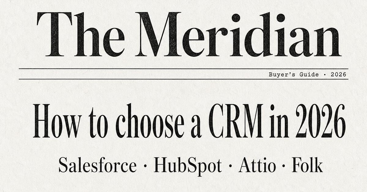
Content & media · the meridian
For Comparison on Content & Media Sites
Buyer's guides — 'How to choose a CRM in 2026' — earn evergreen organic traffic by being decision frameworks, not listicles. The card has to signal that depth or it gets scrolled past as another roundup. Oginify pulls the headline into a serif lockup and arranges the compared categories as a quiet horizontal lineup. The signal lands: this is analysis worth thirty minutes, not a ranked list.
Dev tool · forge.dev
For Comparison on Dev-Tool & Open-Source Sites
On Hacker News, dev Reddit and engineering Slacks the unfurl gets read before the URL, and a sponsored-looking comparison card kills the link there. A balanced monospace grid of 3–4 project wordmarks over a terminal-flavored backdrop lands as honest research instead. Oginify builds the grid directly from the page, so the audience that decides whether your roundup is fair has the answer in the preview.
The Prompts Behind These Four Cards
Each card above started as a one-paragraph prompt. Here are the four we used — paste them into Oginify with your own URL and you'll get the same direction in your brand.
Comparison · stacklane vs incumbent
Generate a 1200×630 Open Graph card for a stacklane.com vs incumbent comparison page. Dark near-black background, tiny "stacklane.com / compare" mono label top-left. Center the card on a clean two-wordmark lockup: big white sans-serif "stacklane" on the left, a thin vertical hairline divider, then big muted gray sans-serif "Incumbent Inc." on the right, with a small "vs" tag inside the divider gap. Below the lockup a single small pill chip reading "Better for shipping teams". Premium B2B SaaS, generous negative space, no decoration.
Compare · kestrel & co / coats
Generate a 1200×630 Open Graph card for a kestrel & co coat comparison page. Warm cream background, small dark espresso "kestrel & co · compare" serif label top-left. Two soft-focus product photos side by side at the center — left: a folded oatmeal wool coat; right: a folded charcoal wool coat — each with a small serif caption beneath: "The Field Coat · $245" on the left, "The Walker · $295" on the right. A thin hairline divider between them and a small italic serif line beneath both reading "Two takes on the same winter." Editorial DTC aesthetic, generous margins, no UI.
Guide · the meridian / crm buyer's guide
Generate a 1200×630 Open Graph card for The Meridian CRM buyer's guide. Off-white paper background with faint texture, classical serif masthead at top reading "The Meridian" with thin hairline rules above and below, small mono stamp on the lower rule reading "Buyer's Guide · 2026". Centered below: a tall serif headline "How to choose a CRM in 2026", and beneath it a quiet single-line serif lineup of four candidate names separated by middots: "Salesforce · HubSpot · Attio · Folk". Black ink only, newspaper editorial typography.
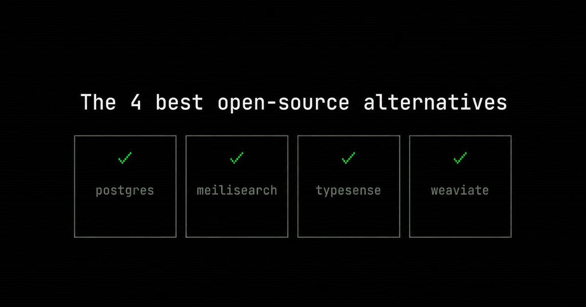
Alternatives · forge.dev / roundup
Generate a 1200×630 Open Graph card for a forge.dev alternatives roundup. Pure black background with a very faint horizontal scan-line texture, small mono label top-left reading "forge.dev / alternatives". Center: big white monospace headline "The 4 best open-source alternatives". Below the headline a balanced 4-up monospace grid of project wordmarks in muted gray-green: "postgres", "meilisearch", "typesense", "weaviate", each in its own small bordered tile with a tiny ✓ above the name. Hacker / open-source aesthetic, pixel-perfect type, no decoration.
Comparison Page Open Graph FAQ
How to balance both logos, when to surface a verdict, and how to keep the card neutral enough to convert.
Should Both Wordmarks Be the Same Size?
Yes. Lopsided logos read as a hit piece and get screenshotted as 'see how biased they are' fuel. Oginify auto-balances both wordmarks to the same optical weight regardless of their original SVG dimensions. The card stays neutral on purpose — neutrality earns the click.
What if I Can't Use the Competitor's Logo?
Trademark law generally permits competitor logos in honest comparative advertising, but you should check with counsel for your jurisdiction. As a fallback, Oginify offers a typographic alternative — both product names in the same wordmark style — which sidesteps the question entirely.
Where Do Comparison Pages Get the Most Traffic?
Organic search ('X vs Y' is a high-intent query bucket) plus social shares in private buyer Slacks, Reddit communities for the category, and LinkedIn DMs between consultants and clients. The card matters most in the social channels because there's no search snippet to lean on.
How Often Should I Update the Card?
Whenever the underlying matrix changes — competitor ships a feature, you ship a feature, pricing moves, or a Capterra/G2 score swings. The card is a snapshot of a verdict; stale snapshots erode trust. Re-run the URL after every meaningful edit.
Can the Card Work for 3-way or 4-way Comparisons?
Yes. Oginify renders up to 4 logos in a balanced grid for roundup content. Beyond 4, the card starts to feel like a category map rather than a comparison — at that point switch to the buyer's-guide layout, which uses a category headline instead of logos.
Win the Comparison Thread
Paste any 'X vs Y' URL and get a comparison-ready 1200×630 Open Graph card in seconds.