
Plan launch
Debut a New Enterprise Tier
Shipping a fourth column? Regenerate the card with the fresh matrix before the announcement thread goes out.
Pricing URLs get forwarded to the person who signs — pasted into deal threads, dropped into procurement emails. Put the actual plan and number on the unfurl instead of your logo.
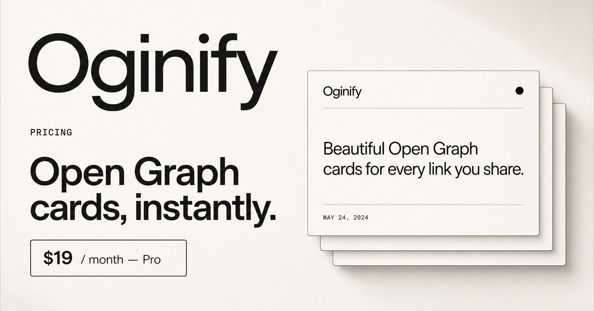
Built for pricing pages that need to confirm the price the moment the link unfurls — not make the recipient click through to find out.
Oginify reads the plan name and headline price straight off the live pricing table. The card surfaces them as a chip on the unfurl, so the recipient sees '$49 / user / month — Team' before they decide to click. Higher click-through, fewer wasted clicks.
Pricing changes more often than any other page on a B2B site — new plans, regional pricing, promotional discounts. Re-run the URL after every change and the card refreshes in seconds, so the unfurl in a year-old Slack thread doesn't quote a stale price.
If your pricing page has anchor URLs per plan (#team, #enterprise, #startup), Oginify generates one card per anchor. The Team link in your sales email shows the Team price; the Enterprise link in your procurement deck shows Enterprise.
Pricing typos that survive into Slack unfurls are an expensive kind of regret. Use the built-in Open Graph validator to confirm the card renders the right plan, the right price and the right currency before the URL goes out.
Skip the spec-checking. Every generation ships with the full Open Graph and Twitter markup — width, height, og:image:alt, and the price chip wired into og:description. Paste the block into your pricing page's <head>; the chip then travels every time anyone shares the URL.
The fastest way to see whether the price-chip move works on your specific pricing page is to run it. Paste the URL, watch four cards generate in the browser, decide. There's no account to create before you find out and nothing to install before the next price change.
SaaS · stacklane.com
$49 / user / month — Team. That chip on the unfurl is the entire game for B2B pricing cards, because the alternative is forcing every recipient to click through just to find out what they came to find out. Oginify reads the plan tier straight off the live pricing table and surfaces the headline plan name plus per-seat price directly on the card — the link does the selling before the click.
E-commerce · kestrel & co
Subscription boxes, memberships, bundle pages — buyers compare them in private group chats, and what they want on the unfurl is the monthly price, the cadence and the bundle savings. Oginify reads all three off the page and lays them into a premium editorial card that holds the brand's look instead of swapping it for a SaaS-style chip.
Content & media · the meridian
A journalism site's membership pricing converts on trust, and a SaaS-flavored chip card is the fastest way to break trust. Oginify keeps the publication's masthead serif intact and renders the membership tier and annual price as a quiet editorial lockup — continuation of the editorial voice rather than checkout-interface interruption.
Dev tool · forge.dev
Usage-based pricing is information-dense; engineers want the unit, the free tier and the next price band before they decide whether to click through. A flat unfurl gives them none of that. The terminal preset treats the card like documentation — price-per-unit on one line, free quota on the next, upgrade band underneath. By the time they click, the question is configuration, not cost.
Plan pages get shared inside procurement threads and buyer chats. The image should carry the numbers the conversation is about.
Plan launch
Shipping a fourth column? Regenerate the card with the fresh matrix before the announcement thread goes out.
Teardown
A rate-card essay lands better when the card mirrors the exact plan grid the post walks through, seat prices and all.
Sales assist
Solo operators like indie founders running sales themselves drop the pricing URL in Slack; the card previews the plan for the buyer.
Renewal
A yearly rate change should not leave last year numbers stamped on every social share still floating around.
Pricing shares are decision moments — the card has to show tier, headline number and one differentiator without turning into a screenshot of the table.
Lead with 'From $9/mo' or 'Free forever, then $12'; the full ladder reads better on the page than on a 630-tall image.
'per seat', 'per project', 'per 1M requests' — the unit is what stops readers assuming your plan works like the last SaaS they saw.
One line under the number: 'unlimited pages', 'includes API', 'no per-seat markup'. That line is the reason someone shares the page.
HomepageArticles & blog postsDocs & API referencesCase studies & customer storiesChangelog & release notesComparison & vs pagesAbout & company pages
High-intent OG cards for pricing pages shared in deals, threads and proposals.
Paste your /pricing URL. The generator reads the tier names, the leading price and the free-trial CTA, and composes a card that leads with the price and plan name — because 'X starts at $Y' is the exact question the person sharing the URL is answering.
Because pricing URLs travel through selection-intent threads and sales conversations where the receiver is already evaluating the tool. A generic homepage-style card wastes the impression; a price-forward card answers the question before they click and shortens the eval cycle.
Yes when the price is stable and one number tells the story. Skip it when pricing depends on usage tiers (contact sales), because a specific number without context misleads. In that case, lead with the plan structure ('Team, Growth, Enterprise') and the free-trial CTA.
Regenerate the same URL — the crawler reads the current price from your live pricing page and paints a fresh card. Swap the og:image path, then clear the Meta Sharing Debugger and X Card Validator caches so unfurls refresh immediately across social platforms.
Yes. The generator reads the primary CTA on the pricing page and mirrors its language on the card ('Start Free', 'Try 14 Days', 'Book Demo'). Keep the CTA identical between the page and the card so visitors don't experience a bait-and-switch on click.
Screenshot APIs capture the pricing table as-is — cluttered, small type, badly cropped at 1200×630. Oginify composes an original card that leads with the price and plan name at readable scale. Same content, purpose-built layout.
Paste your pricing URL and get four 1200×630 Open Graph cards with the real price chip. No signup.