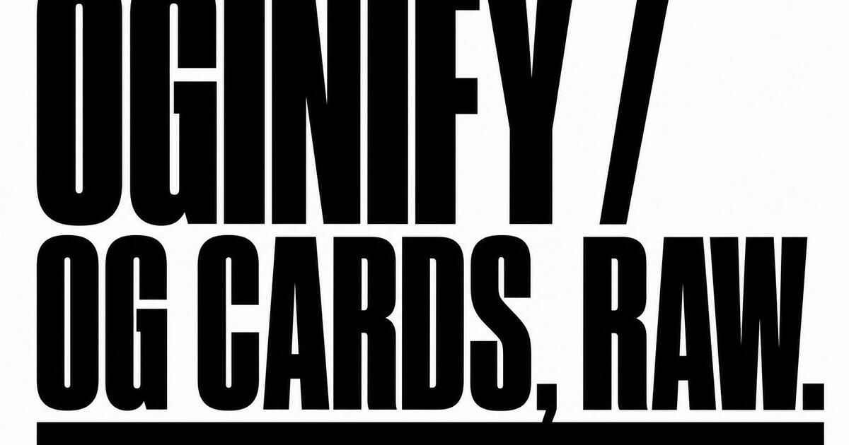
Brutalist OG Image Generator
Heavy borders, flat offset shadows, exposed grids and one violent neon accent. Neo-brutalism is the design trend that broke the AI-generic look — paste any URL and get four 1200×630 cards in the style that's stopping feeds in 2026.
Why Choose Oginify
Brutalist is the look that broke the AI-generic feed in 2026 — Linear's launches, Vercel's product posts, half of Hacker News's most-shared cards. Below: what defines it, who's already shipping it, and why it's a different animal from neo-brutalist.
Signature Characteristics
Heavy 3–6px black borders, hard flat shadows with zero blur, one saturated neon accent (yellow, lime, or magenta) doing the entire color job, max-weight black headlines stretched edge-to-edge, raw system or default web fonts, and grids that deliberately break — content shoves against margins instead of breathing inside them.
Who Actually Ships It
Gumroad leans on raw blocks and oversized type across its product pages. Bloomberg Businessweek covers turn each issue into a brutalist poster. Balenciaga and MSCHF use stripped HTML as a fashion statement. Awwwards' brutalism collection and Are.na's interface both treat constraint as the aesthetic.
Vs Neo-Brutalist
Same skeleton — black borders, flat shadows — opposite temperature. Brutalist is raw: black canvas, one neon, no comfort, designed to confront. Neo-brutalist swaps the black for cream, the neon for pastel sticker blocks, and adds tilted ★ badges. Pick brutalist for manifestos and shock launches; pick neo-brutalist for product-led growth pages that still want to delight.
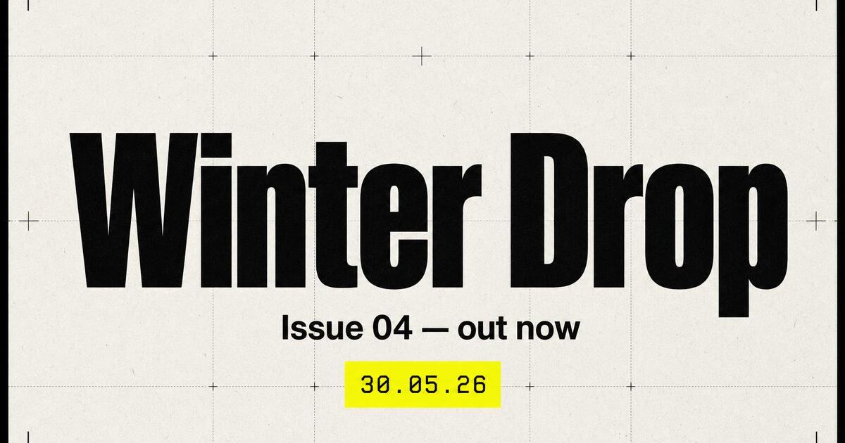
Launch · winter drop
For Product Launches
A launch link only gets one impression in feed — it either stops a thumb or it doesn't. Brutalist makes that impression unambiguous: max-weight headline, a single neon accent block, a date stamp so the announcement reads as time-bound. Pair it with a launch headline that is itself a verb ("Winter Drop", "Series A", "v3 is out") and the card behaves like a stage cue.
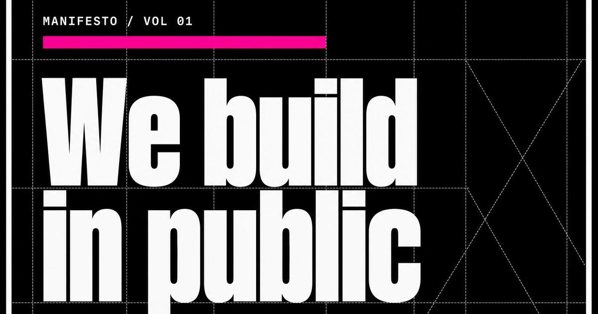
Manifesto · we build in public
For Manifestos & Positioning Posts
Manifestos need to read as confident, not corporate. Brutalist's stark black ground, white display type and exposed grid construction signal a stance, not a sales page. Use it for "we believe", "we ship in public" or "the new way to ___" posts — anything where the headline is a position, not a product update.
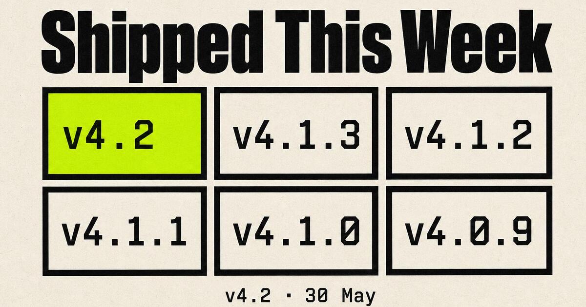
Changelog · shipped this week
For Changelogs & Release Notes
Brutalist's modular grid is the rare style that makes a list of version numbers feel like a poster. Version tiles, one highlighted with the accent color, a tight monospace subtitle — engineers recognize the format instantly.
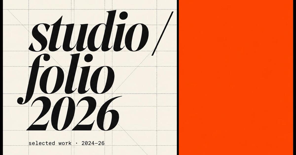
Portfolio · studio / folio 2026
For Design Studios & Portfolios
Studios live or die on the share image — it's the only sample a stranger sees before they click. Brutalist's split-layout, italic serif display on the left plus a violent accent block on the right reads as confident and design-forward without saying the word "design" anywhere.
The Prompts Behind These Four Cards
Each card above started as a one-paragraph prompt. Here are the four we used — paste them into Oginify with your own URL and you'll get the same direction in your brand.
Launch · winter drop / issue 04
Generate a 1200×630 Open Graph card in the Brutalist style for a product launch ("Winter Drop · Issue 04"). Max-weight black display headline on cream paper, a single neon yellow accent block behind a date stamp, hard 4px borders, exposed grid marks. No gradients, no drop shadows, one accent — never two.
Manifesto · we build in public
Generate a 1200×630 Open Graph card in the Brutalist style for a manifesto post ("We build in public"). Stark black ground, large white display headline, magenta accent rule under the kicker, visible grid construction lines. Reads as a stance, not a sales page.
Changelog · shipped this week
Generate a 1200×630 Open Graph card in the Brutalist style for a changelog ("Shipped This Week"). Modular grid of version tiles on cream, one tile highlighted with a lime accent block, tight monospace subtitles ("v4.2 · 30 May"). Engineers should recognize the format instantly.
Portfolio · studio / folio 2026
Generate a 1200×630 Open Graph card in the Brutalist style for a designer portfolio ("studio / folio 2026"). Split layout: italic serif display wordmark on the left, electric orange accent block on the right, exposed grid marks and crop ticks. Confident and design-forward without using the word "design".
Brutalist Style FAQ
When to pick Brutalist over a quieter style, how it performs across platforms, and how to keep the look honest without sliding into noise.
When Should I Pick Brutalist over a Quieter Style?
Pick Brutalist when the page is meant to be an event — a launch, a manifesto, a campaign, a single sharp opinion. For evergreen marketing pages, documentation, pricing or anything that needs to feel safe and considered, switch to Swiss or Magazine. Brutalist's whole job is to refuse to blend in, which is a feature on launch day and a liability the rest of the year.
Will Brutalist Cards Look Right on LinkedIn?
LinkedIn skews B2B and rewards clean, professional cards — Brutalist works there but only for the right post (a contrarian take, a hot opinion, a launch). For everyday LinkedIn content, the Swiss preset performs better. Run both as a 2-variant A/B test, ship the one with higher CTR after 24 hours.
Can I Change the Accent Color Away from Neon?
Yes. Brutalist is defined by structure — heavy borders, flat shadows, exposed grid, max-weight type — not by the neon itself. Oginify will pick an accent that contrasts hard against your brand's primary; if you have a brand color that already pops, the engine uses that. The only rule is one accent, never two.
Is Brutalist Accessible at Small Sizes?
Yes — that's why it survived as a trend. The default 4px borders and max-weight typography mean the card still reads when feeds downsample it to 600×314 on mobile. Pass the grayscale test if you want to be sure: convert the card to black and white; if the hierarchy still holds, color isn't doing the work.
One URL. Four Brutalist Cards.
Paste any page URL and Oginify generates four Neo-brutalist 1200×630 cards in seconds — A/B-ready, no signup.