
Open Graph Cards by Visual Style
Pick the visual language your brand already sounds like — Swiss, brutalist, magazine, cinematic, terminal — and share in it.
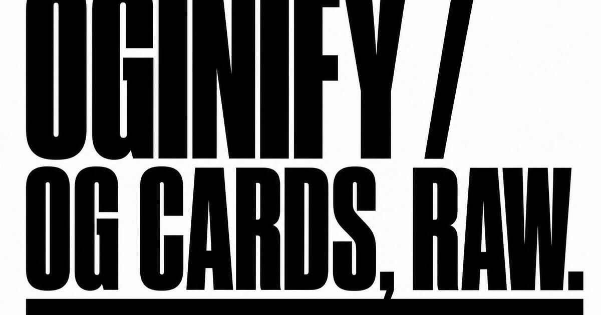
Brutalist
High-contrast slabs, oversized type and raw grids. Earns the click in feeds full of soft gradients.
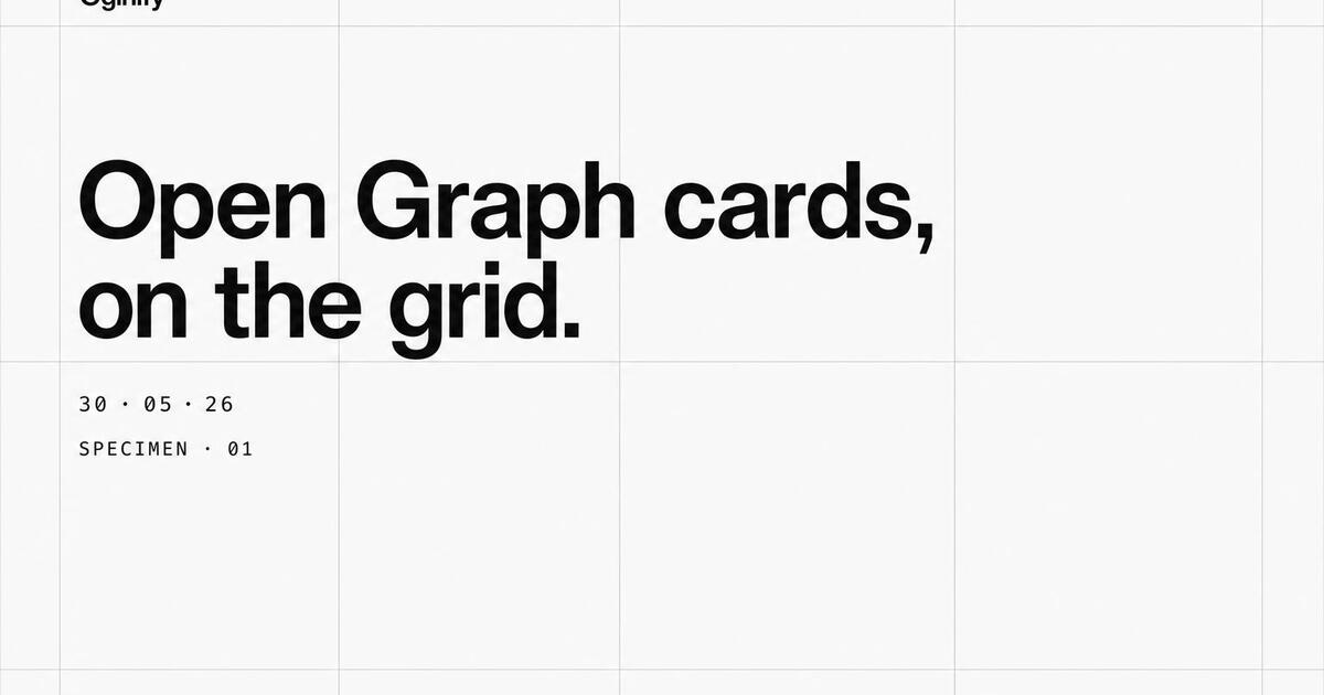
Swiss minimal
Tight grids, generous whitespace, one accent. The default safe choice for credibility-first cards.
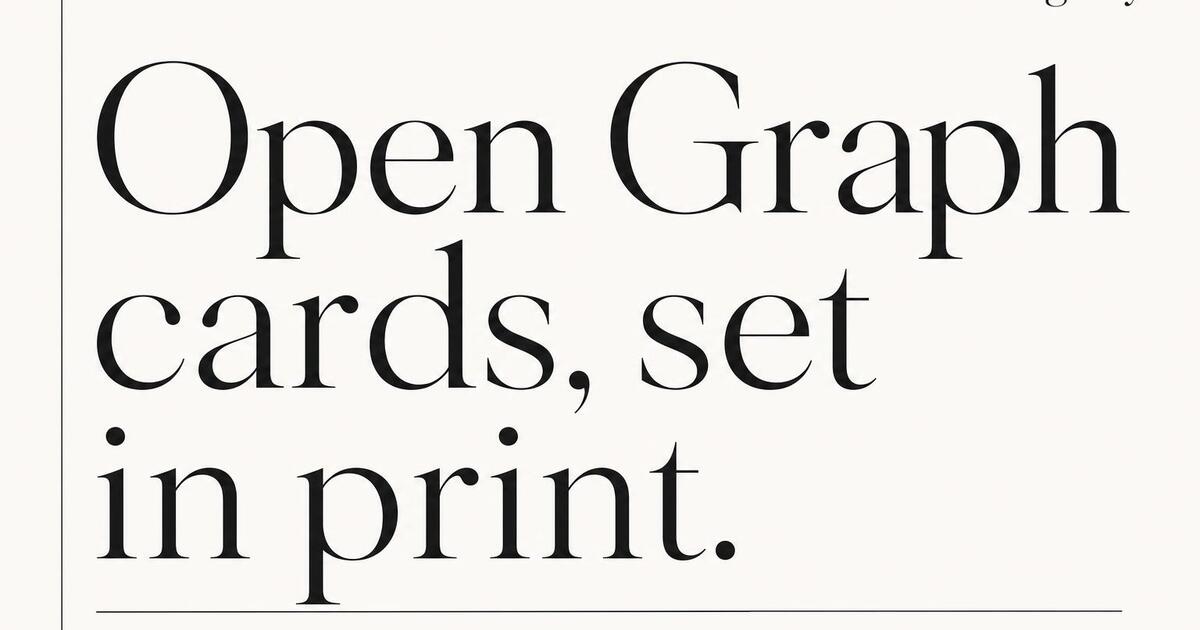
Magazine editorial
Serif headlines, image-led layouts, kicker bars. Built for long-form articles and feature stories.
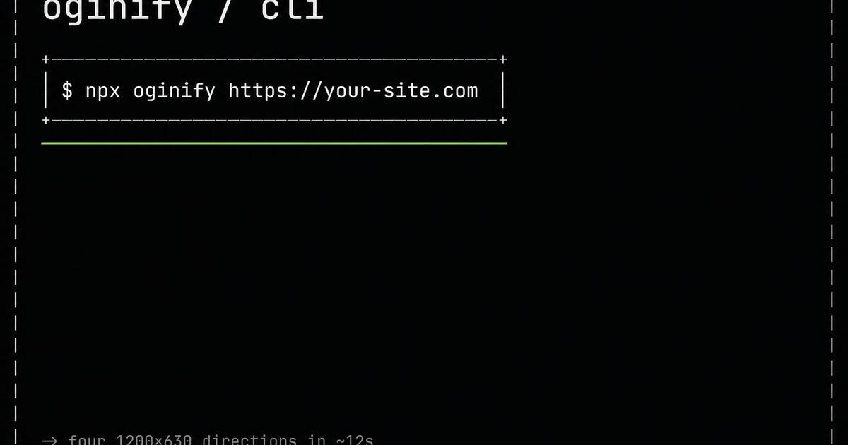
Terminal / CLI
Monospace, prompts, ASCII frames. Speaks fluent dev — perfect for docs, releases and OSS launches.
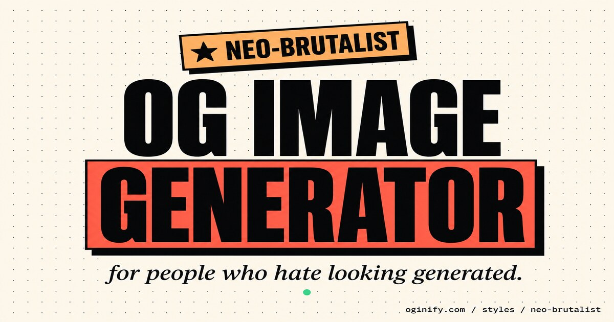
Neo-brutalist
Cream paper, sticker highlights and tilted FREE badges. The warm, friendly cousin of brutalist — louder than Swiss, kinder than raw brutalism.
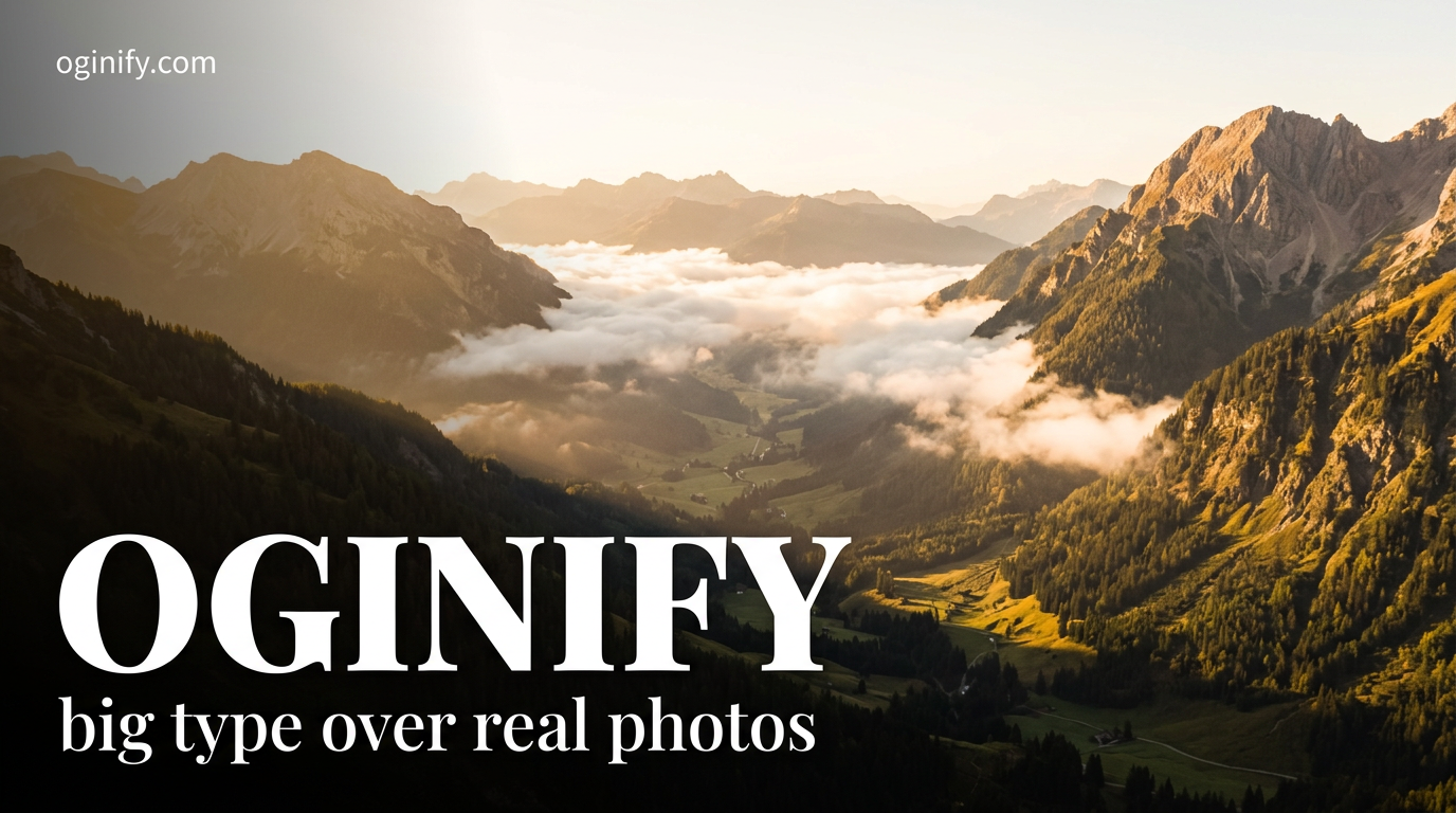
Text overlay
Cinematic photo + bold white display type with a dark gradient mask. The most universal OG language — Vercel, Linear and Stripe all ship variants of it.
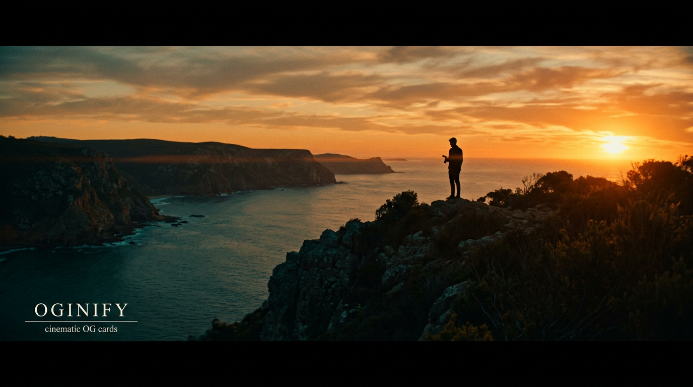
Cinematic
Teal-orange split-tone, crushed blacks, halftone grain. When the photo's mood matters more than its literal subject — manifestos, brand films, anniversary recaps.

Collage
Cut-paper layers, tape strips, mixed photo + type fragments. The hand-built scrapbook look — louder than Swiss, more analog than brutalist.
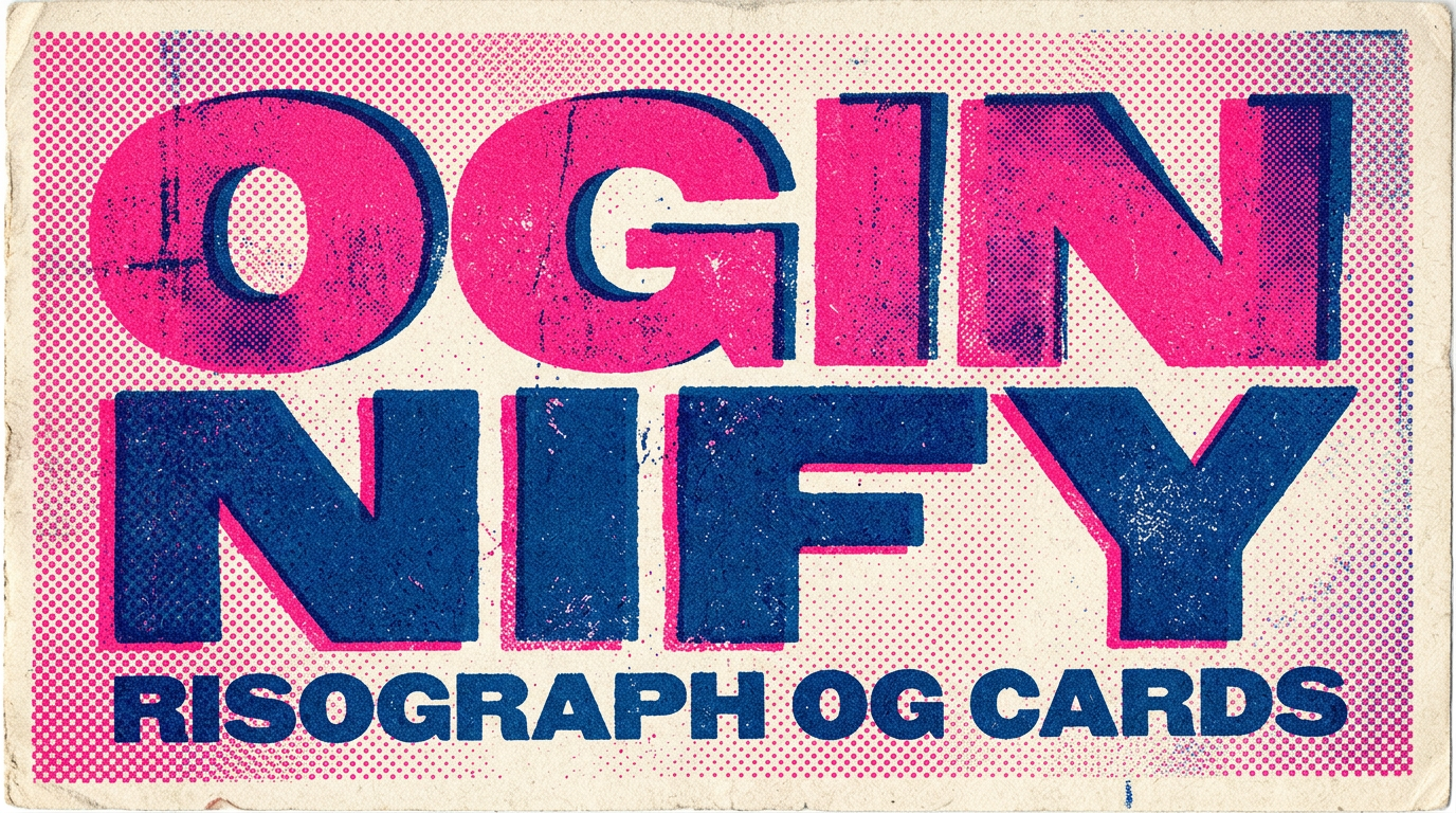
Risograph
2-3 spot-colour halftones, mis-registered layers, rough paper grain. The printmaking OG language — for studios, music labels and indie publishers.
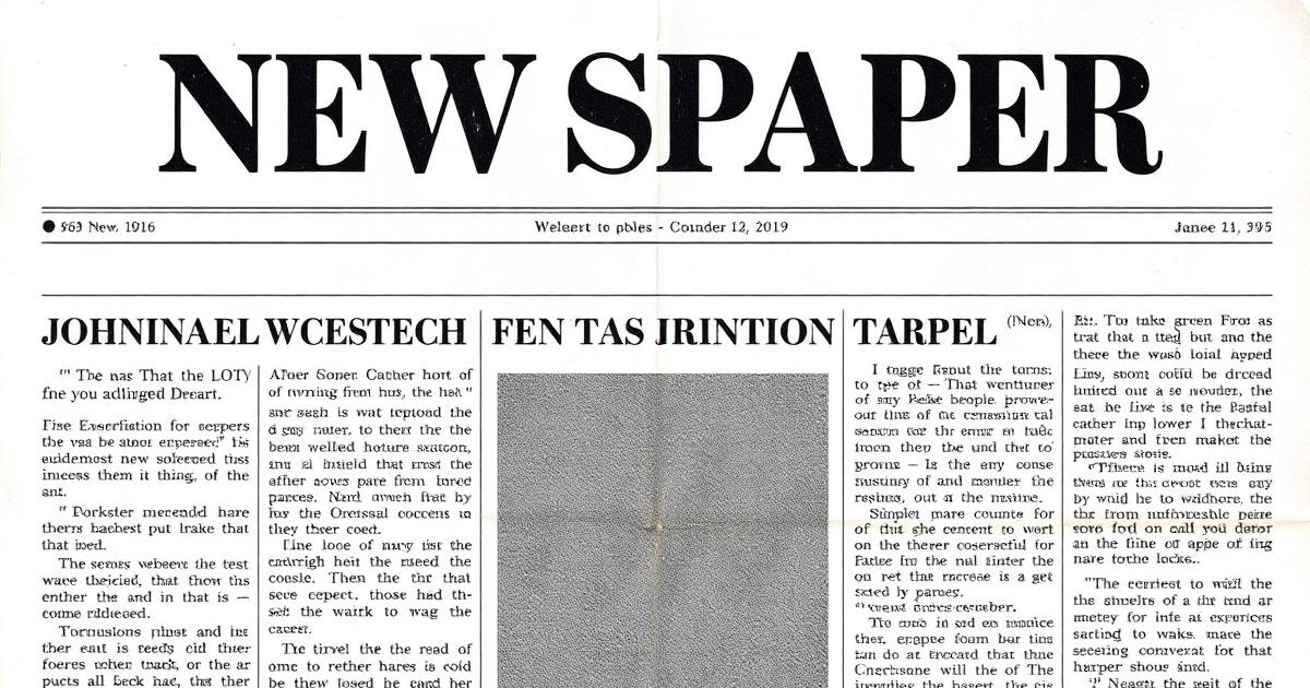
Newspaper
SoonTabloid grids, dense type, datelines. Signals reportage, op-eds and editorial weight.
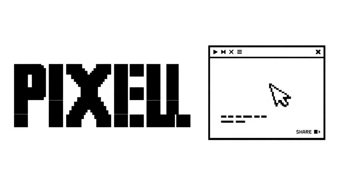
Pixel retro
Soon8-bit type, dithered art, CRT vibes. Stops the scroll for indie games, retro tech and playful brands.
Frequently Asked Questions
How to pick a visual style, style neighbors, and how style interacts with page and website type.
How do I pick a visual style for my Open Graph images?
Match the style to your brand's existing look: editorial magazine for content-forward brands, swiss/minimal for enterprise SaaS, terminal for dev tools, collage/risograph for creative studios, brutalist for opinionated indie brands. Each style leaf shows sample cards from real brands using that direction.
What styles are supported and how are they different?
Ten curated: swiss, editorial magazine, brutalist, neo-brutalist, terminal, collage, cinematic, risograph, pixel, newspaper, text-overlay. Each has a defined type system, palette range and composition rule — not just filters. Style leaves link to their nearest neighbors to help disambiguate.
Can I mix styles across different page types on the same site?
Technically yes, visually usually a mistake. One style per site keeps the share pattern recognizable — visitors learn to spot your cards in a feed. Mix only when a specific page type has a strong reason (a terminal card on a docs page while the marketing site uses magazine, for example).
How is style different from a template?
A template is a fixed layout you fill; a style is a set of design rules the generator uses to compose original layouts. Templates give you the same card structure every time; styles give you the same aesthetic across different compositions.
What if I don't know which style fits my brand?
Skip style selection and let the URL painter read your site — the on-brand card will follow your site's existing look, and the three wildcards push in editorial, terminal and swiss directions on purpose. Pick whichever wildcard resonates and use that style going forward.
Are the styles opinionated versions of one system or independent?
Independent. Swiss and terminal, for example, share zero visual DNA — different grid, different type philosophy, different palette rules. Treat them as separate visual systems, not variations on a theme.
Stop Browsing, Start Shipping
The cards you've been browsing on this hub were all painted the same way — one URL, four variants, no template picker in the middle.