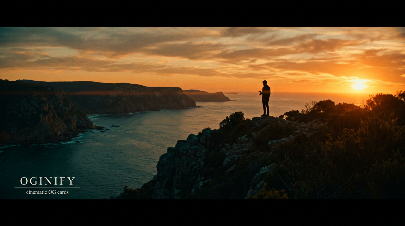
Cinematic OG Image Generator
Teal-orange split-tone, crushed blacks, halftone grain and a single line of editorial type. The mood-led cousin of text overlay — for pages where atmosphere is the message, not the photograph itself.
Why Choose Oginify
Cinematic isn't text overlay with a filter on top. The graded photograph, the crushed blacks, the single editorial line of type — each one is a deliberate choice, and the alternative is a different conversation. We cover the language, the brands fluent in it, and when to pick it over plain text overlay.
Signature Characteristics
Teal-orange split-tone (shadows pushed to cyan, highlights to amber), crushed blacks (lift ≈ 0, shadow γ < 1), subtle halftone or 35mm grain across the frame, a soft vignette dropping the corners 15-20%, and a single short editorial headline in a serif or wide sans, usually anchored to the lower-left. One mood, one headline, one grade — never two.
Who Actually Ships It
Apple's product films open with this exact grade. Linear's anniversary recaps lean on cinematic for brand-film moments. Nothing's launches live here. Arc's brand pages move between text-overlay and cinematic depending on whether they want the photo raw or graded. Off Brand and Studio Output ship it as a default for client pages.
Vs Text Overlay
Same skeleton — photo plus white type — but cinematic re-grades the photo as the protagonist (split-tone, grain, vignette) and treats the headline as a film title, while text overlay leaves the photo raw and uses a gradient mask plus headline to add legibility. Pick cinematic when mood is the message; pick text overlay when the literal photo is the proof.
Launch · v3 is live
For Product Launches with a Brand-Film Tone
Most launches read as press releases. A cinematic launch card reads as a film title — the product photograph graded into teal-orange, light grain across the frame, a single short headline anchored lower-left. The card promises a story before the visitor opens the page.
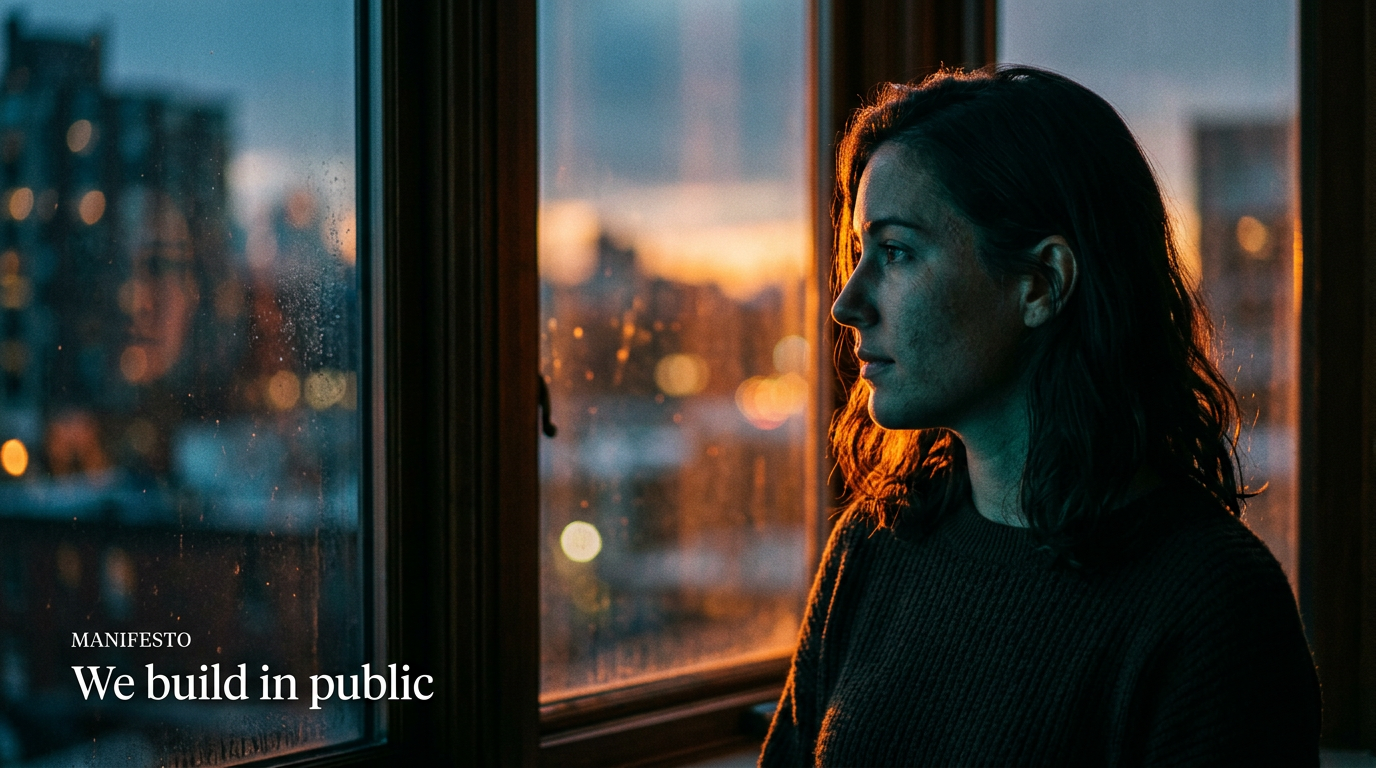
Manifesto · the case for
For Manifestos & Brand Essays
Manifesto essays live or die on the share preview's gravity. A cinematic frame — sky, hands, the back of a desk lamp — graded warm and grainy, with a 4-word headline set in a high-contrast serif, lifts a text post into something that feels worth 8 minutes of reading.
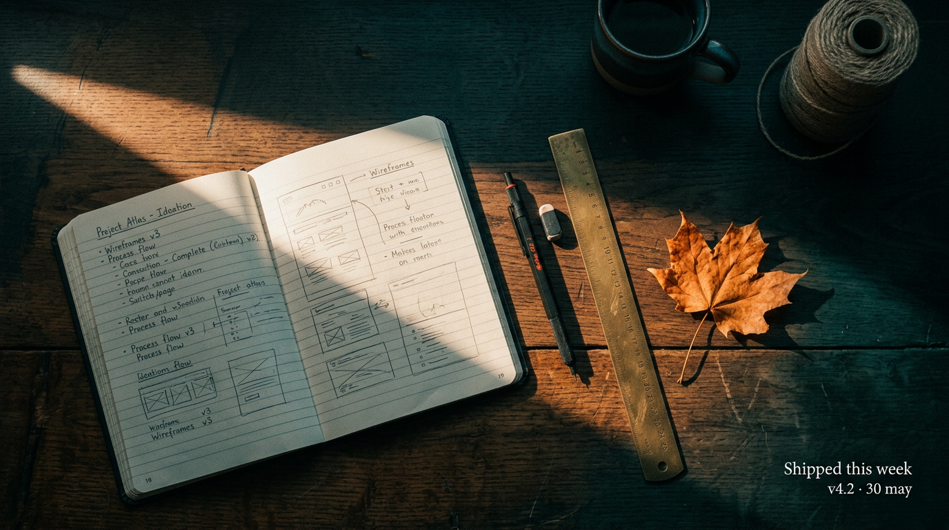
Year in review · 2025
For Anniversary Recaps & Changelogs
Annual recaps and milestone changelogs benefit from looking back rather than shipping forward. A cinematic grade across an archive photograph — early prototype on a desk, first office, hand-written notes — gives those posts the texture of a documentary still rather than a marketing brief.
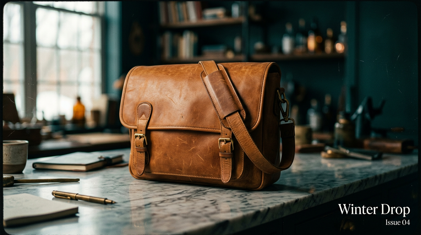
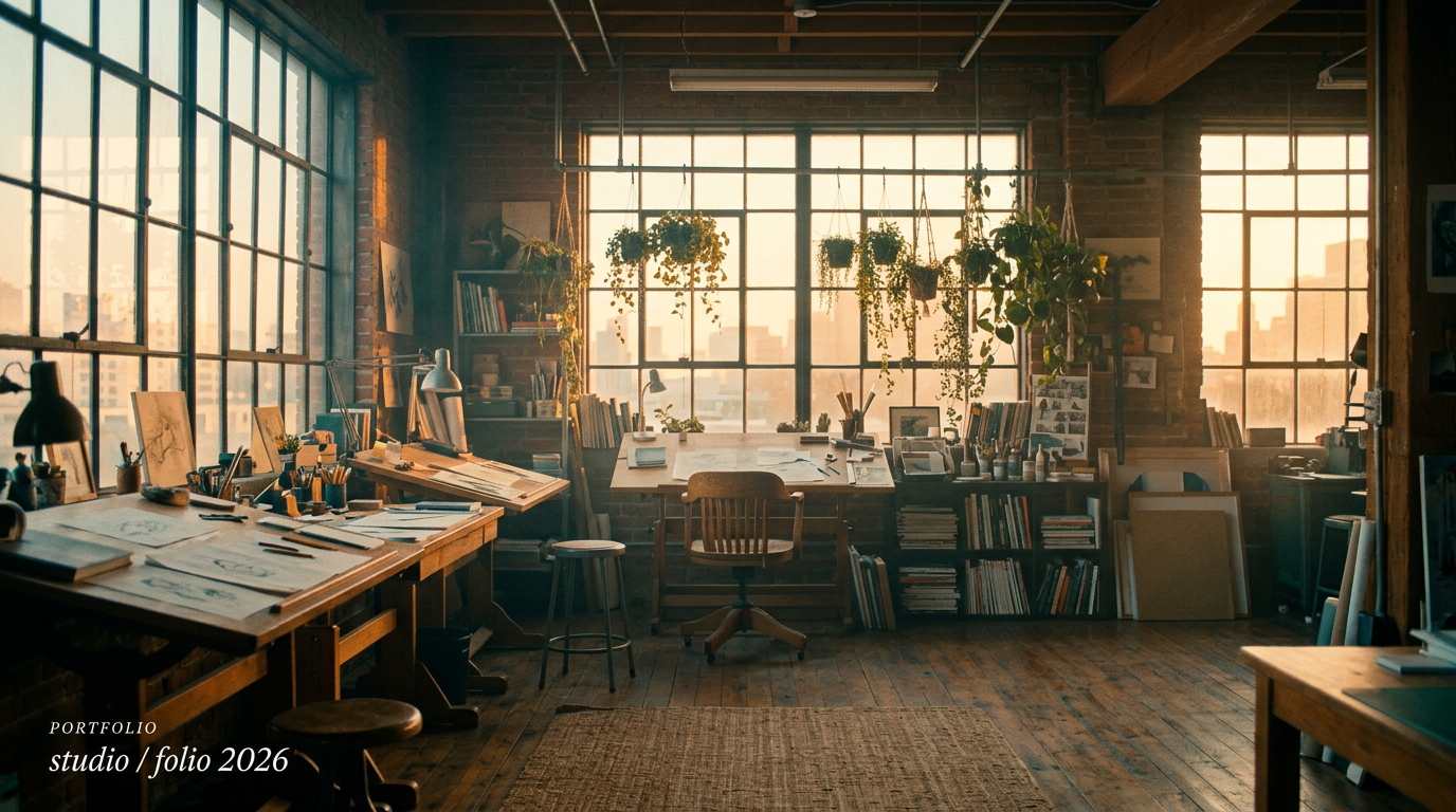
Portfolio · selected work
For Studio Portfolios & Brand Films
Studios that sell on taste need share previews that read as taste. The cinematic grade does that work for them: a graded hero shot of the work, light vignette, single italic serif headline. The card is the trailer, the page is the film.
The Prompts Behind These Four Cards
Each card above started as a one-paragraph prompt. Here are the four we used — paste them into Oginify with your own URL and you'll get the same direction in your brand.
Launch · v3 is live
Generate a 1200×630 Open Graph card in the Cinematic style for a product launch ("v3 IS LIVE"). Photograph of the product re-graded in teal-orange split-tone, crushed blacks, subtle halftone grain, soft vignette dropping the corners 15-20%. Short max-weight headline anchored lower-left. Reads as a film title, not a press release.
Manifesto · the case for
Generate a 1200×630 Open Graph card in the Cinematic style for a manifesto essay ("THE CASE FOR SHIPPING SMALL"). Atmospheric photograph — sky / hands / desk-lamp — re-graded teal-orange, light 35mm grain, soft vignette. Short serif display headline anchored lower-left, no logo lockup. Magazine-cover gravity, brand-film tone.
Year in review · 2025
Generate a 1200×630 Open Graph card in the Cinematic style for an anniversary recap ("YEAR IN REVIEW · 2025"). Archive-style photograph — early prototype on a wooden desk, first office, hand-written notes — graded warm-teal, grainy, vignetted. Documentary-still tone, not marketing tone.
Portfolio · selected work
Generate a 1200×630 Open Graph card in the Cinematic style for a studio portfolio ("SELECTED WORK 2026"). Graded hero shot of design work — installation / packaging / screen — teal-orange split-tone, soft vignette, single italic serif headline lower-left, small monospace studio mark lower-right. Trailer, not portfolio thumbnail.
Cinematic Style FAQ
When to pick cinematic over text overlay, how the teal-orange grade survives platform JPEG compression, and how to keep the mood honest without sliding into stock-film cosplay.
When Should I Pick Cinematic over Text Overlay?
Pick cinematic when the page is mood-led — manifestos, brand films, anniversary recaps, studio portfolios — and the photo's atmosphere matters more than its literal subject. Pick text overlay when the page is evidence-led (launches, changelogs, case studies) and the photo needs to read as unaltered truth, not as a graded scene.
Will the Teal-Orange Grade Survive LinkedIn / X JPEG Re-Compression?
Yes — split-tone grades compress more gracefully than high-saturation single-hue palettes because the colour information is already concentrated in two complementary axes. The grain helps too: it gives the JPEG encoder something to round to, which avoids posterising in the shadows.
Does Cinematic Need a Serif Headline?
No, but it benefits from one. The grade reads as editorial, so a high-contrast serif (display or italic) sits inside the same convention; a wide sans (the Vercel / Linear school) works when the brand is already sans-serif everywhere. Avoid geometric / techy sans — those read as marketing and break the brand-film tone.
Can Cinematic Work with AI-Generated Photography?
Yes, and often better than text overlay. The cinematic grade hides AI artefacts (over-smooth skin, too-clean specular highlights) under the split-tone + grain layer. If the source is fully 3D-rendered, cinematic is the safer choice — it pushes synthetic frames toward photographic territory.
One URL. Four Cinematic Cards.
Paste any page URL and Oginify generates four 1200×630 cinematic cards in seconds — split-tone grade, halftone grain, single editorial headline. A/B-ready, no signup.