
Studio
Launch a Handcrafted Brand
The debut card is a paper collage — clipped photograph, torn-edge type, one vermillion stamp for the wordmark.
Cut-paper layers, masking-tape strips, torn photo crops, and mixed display type — the hand-built scrapbook direction, louder than Swiss and warmer than brutalist.
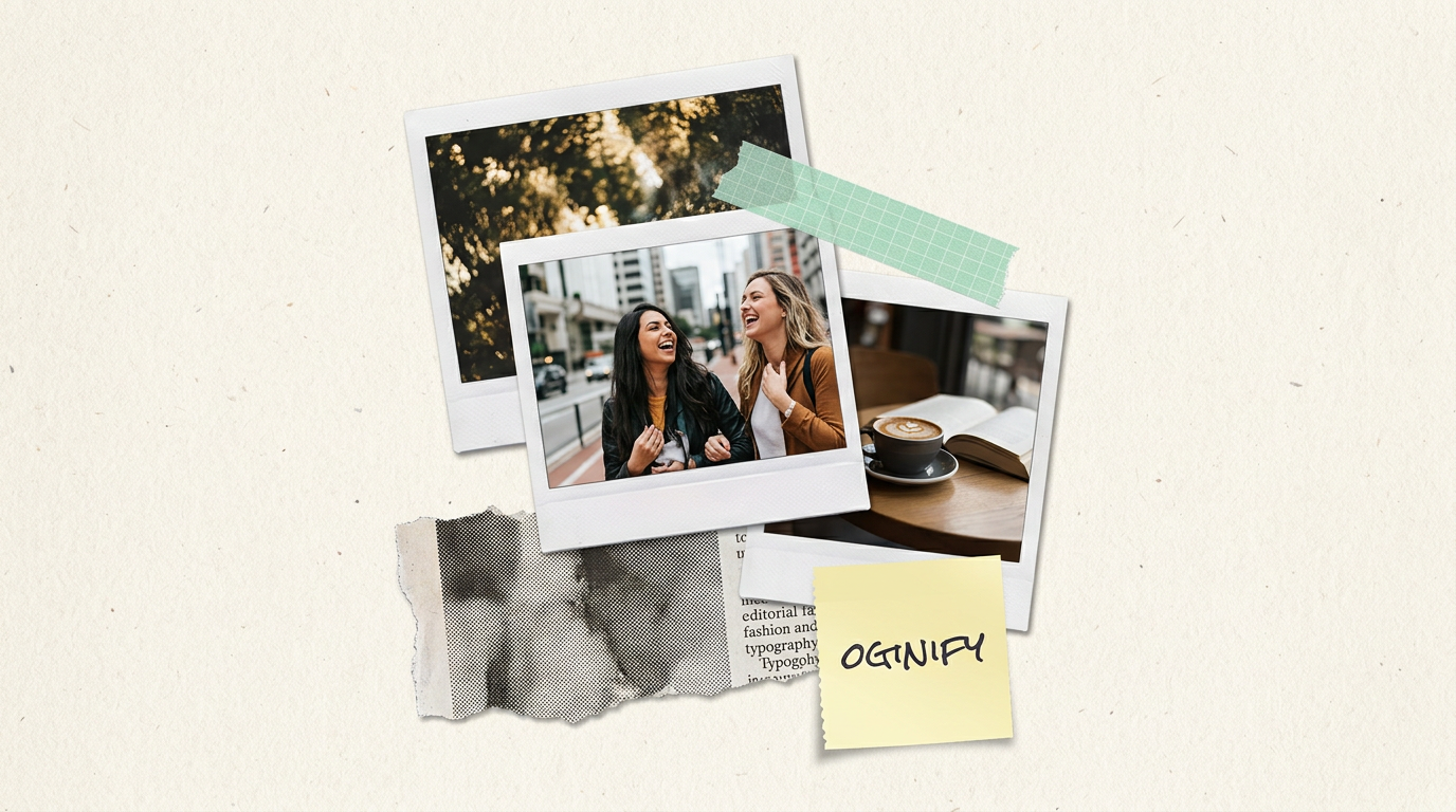
Cut-paper, masking tape, torn edges — collage is the loudest visual register on the OG spectrum, and it's not the same thing as neo-brutalist sticker pop, however often the two get conflated. Below: the characteristics that define it, the editorial brands shipping it, and where the line actually sits.
3-5 stacked paper layers with visible torn or cut edges, one or two strips of masking tape (skewed 6-8°) anchoring photo crops, mixed type (display serif headline + condensed sans subhead + monospace caption), warm-paper background (#F4EFE3 area), light pencil scribbles or arrows as connective tissue, and at least one photograph cut into a non-rectangular shape.
It's Nice That uses cut-paper share cards for festival recaps. Are.na's editorial covers live in this language. Bandcamp Daily's feature covers run a softer version. Wallpaper* magazine's online editorials use the same grammar. Independent zines like Avaunt and The Gentlewoman both ship collage-style social tiles.
Both are hand-built, but neo-brutalist is a digital-native sticker language (flat blocks, hard offset shadows, cream paper) while collage is an analog-native scrapbook language (torn edges, tape, layered photography, pencil marks). Pick collage when the brand wants "hand-built editorial"; pick neo-brutalist when the brand wants "hand-built product".
Recap · festival 2025
Festival and event recap pages benefit from a card that feels printed rather than rendered. Collage stacks three torn photo crops, a masking-tape title strip and a pencil-arrow caption — the card reads as a programme page from the festival itself, not a marketing asset.
Manifesto · the case for
A manifesto needs a card that reads as a point of view, not a topic. Collage with a torn newspaper-style headline strip, a cut-paper portrait crop and a pencil underline gives a short manifesto the same gravity an op-ed page gets in a printed weekend paper.
Field notes · this month
Engineering-led changelogs read better in monospace grids, but editorial / studio retrospectives read better in collage: torn process photos, a typewriter-style headline, a sticky-note bullet list. The card frames the post as field notes rather than a release log.
Portfolio · studio / zine 2026
Independent designers and zines selling on taste need share cards that look like the work they make. Collage gives the share card the same handmade fingerprint as the printed thing — cut-paper portrait, masking-tape wordmark, pencil-scribble year mark — and reads as an artefact, not a thumbnail.
Layered scraps, mixed textures, deliberate imperfection — collage signals craft in a feed of vector logos.
Studio
The debut card is a paper collage — clipped photograph, torn-edge type, one vermillion stamp for the wordmark.
Zine
Long-form under a collage card reads as culture writing — the layered composition slows the scroll before the click lands.
Drop
Solo makers shipping physical goods mint per-drop collage cards so each release carries its own layered composition.
Weekly
The recurring digest becomes a collectible visual object when each issue is its own paper composition.
Analog collage cards mix scanned paper, hand-cut edges and typewriter type — deliberate roughness that reads as human on a feed full of gradient AI slop.
Torn paper, tape or staple, and one photographic scrap; the three-layer stack is what separates collage from mere multi-image composition.
Underneath the collage chaos, hold type steady — one weight, one family; the friction between wild image and calm type is the whole point.
Pick one saturated hue — vermillion, cobalt, chartreuse — and use it in exactly one place; the anchor keeps the collage from reading as noise.
BrutalistSwiss minimalMagazine editorialTerminal / CLINeo-brutalistText overlayCinematicRisograph
Cut-paper Open Graph cards with tape strips, mixed photo and type fragments.
Cut-paper layered composition — photographic fragments, textural paper backgrounds, tape strips, hand-torn edges, mixed serif and sans type set at slight angles. The scrapbook look — louder than Swiss, more analog than brutalist, warmer than editorial magazine.
For studios, music labels, indie publishers, food-and-drink brands, and any positioning that leans 'handmade' or 'crafted'. Skip collage for enterprise SaaS, financial services and dev tools — the aesthetic reads as 'unserious' in those categories.
It's Nice That, Are.na, most Wieden+Kennedy campaign pages, Milanote, Kettl Tea, Partake Foods, Warby Parker's editorial content, the launch pages of most 2024 A24 films. Not common on B2B; standard on creative culture.
Yes — collage is a compositional style, not a filter. The generator layers real cut-out photographic fragments, adds paper backgrounds, and places tape strips over element edges. The output has depth (layered z-order) rather than being one flat image with a texture overlay.
Risograph is a printing method — 2-3 spot colors with mis-registered halftones. Magazine editorial is a layout system — serif headlines, kicker bars, gutter grids. Collage is a compositional style — layered fragments with visible construction. All three are 'editorial' but visually distinct.
Legible when the composition has one dominant element (the anchor fragment) and the rest is texture. Multi-focal collages read as noise at feed scale. The rule: one thing bigger than everything else, plus enough textural fragments to signal 'collage' without competing.
Paste any page URL and Oginify generates four 1200×630 collage cards in seconds — cut-paper layers, masking-tape strips, mixed type, hand-built editorial register. A/B-ready, no signup.