Magazine Style OG Image Generator
Serif display headlines, an issue-number kicker, a left-margin byline rule, generous photographic space. Magazine is the editorial direction for long-form articles, newsletter issues, feature stories and any content that wants to be read for twenty minutes instead of skimmed for twenty seconds.
Why Choose Oginify
Magazine and Swiss both descend from mid-century editorial design — but a magazine card and a Swiss card read very differently in feed. Here are the typographic moves that signal magazine, the publications using it now, and the precise point where it stops being Swiss.
Signature Characteristics
Serif display in the headline seat (Tiempos, Canela, Domaine, GT Sectra). Drop caps opening long-reads. Multi-column body. Oversized issue or article numbers as anchors. Hairline rules between sections. Photography-first hero. ALL-CAPS small kickers in tracked sans. Color is editorial — one ink, one paper, one accent.
Who Actually Ships It
The New Yorker turns every article page into a magazine spread. Pitchfork's review template made the giant numeric score into iconography. Bloomberg and T Magazine treat the web as a print issue. It''s Nice That and Are.na''s editorial both ship the same serif-and-rules grammar across long-form features.
Vs Swiss
Both heritage editorial systems, opposite voices. Swiss is sans + grid + neutral — neutral typography that disappears so the product speaks. Magazine is serif + columns + voice — typography is the author, and the layout argues a tone. Pick magazine for narrative essays, manifestos, and long-form launches; pick Swiss for product, pricing, and docs.
Long-form essay
For Long-Form Essays & Features
A 4,000-word essay needs a card that reads as 'worth twenty minutes', not 'three-minute think piece'. Magazine sets the headline in tall serif display type, the byline below a thin rule, the kicker above as an issue mark. The card itself slows the scroll — and a scroll-slowing card is the only kind that wins the click on long-form.
Newsletter issue · 47
For Newsletter Issues
Newsletter issues are a publication, not a content stream. The Magazine preset puts an issue-number kicker on every card so subscribers — and the people they forward issues to — recognize the publication across every share. Substack and Beehiiv newsletters in particular outperform when the cards read as a publication.
Feature story
For Feature Stories & Long-Form Journalism
Feature stories live or die on the headline and the hero photograph. Magazine cards hand both the full stage — generous photographic space above, journalistic display headline anchoring the page — exactly the visual system readers know from print weekend supplements. The unfurl earns the click on its own; the article does the rest.
Op-ed · positioning
For Op-Eds & Positioning Essays
Op-ed pieces need to surface the writer's voice, not the publication's brand. Magazine uses a pull-quote layout — a fragment of the strongest sentence in display type, the byline below, the publication mark small at the top. Half quote card, half publication cover, and the recipient knows which writer they're about to read before they tap.
The Prompts Behind These Four Cards
Each card above started as a one-paragraph prompt. Here are the four we used — paste them into Oginify with your own URL and you'll get the same direction in your brand.
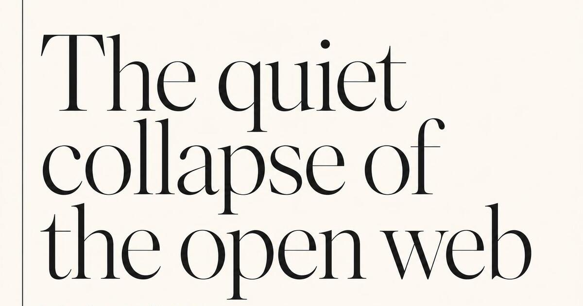
Essay · the meridian / annual 2026
Generate a 1200×630 Open Graph card in the Magazine style for a long-form essay in the meridian / annual 2026. Tall serif display headline ("The quiet collapse of the open web"), thin left-margin rule, small byline below in caps ("By Anna Halloway · 22 min read"), issue kicker top-left ("Annual · 2026"). The card slows the scroll.
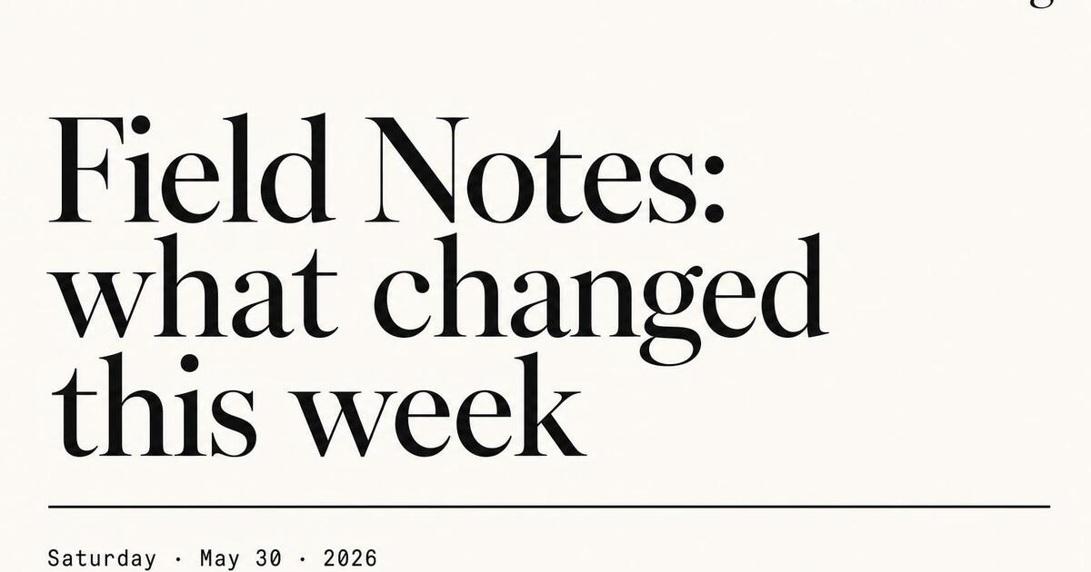
Newsletter · the briefing / issue 47
Generate a 1200×630 Open Graph card in the Magazine style for the briefing · issue 47 newsletter. Mono issue-number kicker top-left, serif display headline ("Field Notes: what changed this week"), publication wordmark small at the head, dateline as a small rule. Reads as a recognizable publication, not a one-off post.
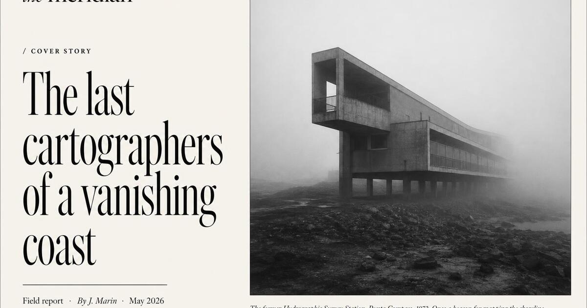
Feature · the meridian / cover story
Generate a 1200×630 Open Graph card in the Magazine style for a feature story ("the meridian / cover story"). Large framed photographic space with caption gutter, journalistic display headline set above it in tall serif, dateline + byline below a thin rule. Behaves like a magazine cover — earns the click on its own.
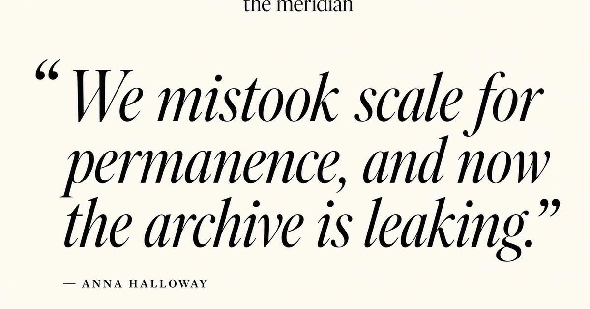
Op-ed · the meridian / pull
Generate a 1200×630 Open Graph card in the Magazine style for an op-ed pull-quote on the meridian. Pull-quote layout: a fragment of the strongest sentence set in display serif italic with open quotes, writer's byline below ("— Anna Halloway"), publication mark small at the top. The card behaves like a quote card and a publication cover at once.
Magazine Style FAQ
When Magazine outperforms Swiss for editorial content, how the issue-kicker works, and which content types it lands on hardest.
Is Magazine Too Formal for a Personal Blog?
Not at all — Magazine is exactly the right default for a personal blog with strong voice. The byline rule and serif headline make your name part of the card; readers learn to recognize your work across every share. Use it freely for personal writing; the editorial framing is a compliment to the post, not a corporate overlay.
Will It Look Right on Substack?
Yes — Substack is one of the strongest fits. Substack issues are explicitly a publication format, and Magazine cards make every issue feel like a publication. Set the og:image URL per post in Substack's settings and every share — quote-tweet, forward, screenshot — uses your Magazine card.
What if I Don't Have a Hero Photo for Every Post?
Magazine works without a hero photo — the typography-led variant uses the headline at maximum size with a wide left margin and a kicker. Most posts don't have a hero photo, and Magazine looks great either way. The serif display headline carries the card by itself.
Is the Issue-Number Kicker Required?
No, but it's a strong signal. Use it for content that is part of a series (newsletter issues, weekly columns, monthly features). For one-off essays, drop the kicker and let the headline take the full vertical space. Both variants are available in every generation.
When Should I Switch from Magazine to Swiss?
When the content is corporate reportage rather than voicy editorial. Annual reports, research papers, formal company posts and analyst-style writing perform better in Swiss — the visual system reads as a corporate publication. Personal voice and feature journalism stay in Magazine.
Editorial Weight, Generated from the URL
Paste any post URL and get four Magazine-style 1200×630 Open Graph cards in seconds. No signup.