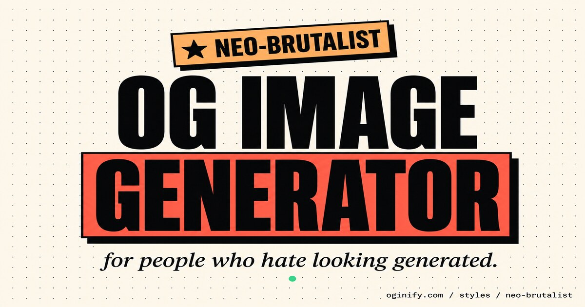
Neo-Brutalist OG Image Generator
Cream paper background, hard offset shadows, sticker-pop highlight blocks behind the headline, tilted FREE badges and mac-window chrome. The warm, friendly cousin of brutalism — paste any URL and get four 1200×630 cards in the style PostHog and Gumroad made the default for 2026.
Why Choose Oginify
PostHog, Gumroad and Linear made neo-brutalist the default house style of 2026 SaaS, but the look gets confused with its harder-edged parent every day on Twitter. Three sections below: the signature moves, the brands shipping each register, and where the two actually diverge.
Signature Characteristics
Cream paper canvas (#FBF7EE-ish, never pure white), hard black offset shadows with zero blur, coral / mint / peach sticker blocks highlighting key words, tilted ★ FREE TOOL paper badges, 3–4px black outlines on every card, monospace micro-labels, and mac-window dots used as decoration rather than UI.
Who Actually Ships It
PostHog runs the loudest version — tilted stickers, hand-drawn callouts on every chart. Pictify built its whole image-card tool in the same language. Resend uses cream + sticker accents across docs. Cal.com sprinkles neo-brutalist blocks in marketing. Gumroad's checkout still anchors the look.
Vs Brutalist
Same skeleton, opposite mood. Classic brutalist is raw black + one neon, designed to confront. Neo-brutalist keeps the borders and flat shadows but swaps black for cream and neon for pastel sticker blocks — the result reads handmade rather than aggressive. Pick neo-brutalist for product-led growth and friendly launches; pick brutalist for manifestos.
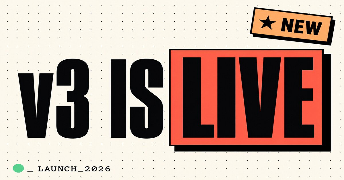
Launch · v3 is live
For Product Launches
Launch links live or die on the first scroll. Neo-brutalist makes that scroll-stop unambiguous: cream paper, a coral highlight block behind the launch verb, a tilted ★ NEW sticker in the corner. Pair it with a verb-headline ("v3 is live", "Series A", "Winter Drop") and the card reads like a stage cue, not a sales asset.
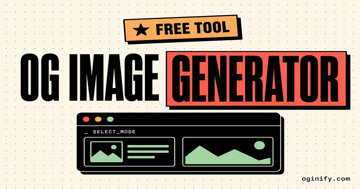
Free tool · OG image generator
For Free-Tool Landing Pages
Free tools earn clicks by looking generous, not gated. A tilted ★ FREE TOOL sticker over a mac-window mockup is the genre's entire visual contract — PostHog and Pictify run the same playbook. Neo-brutalist gives free-tool pages a card that previews the offer instead of describing it.
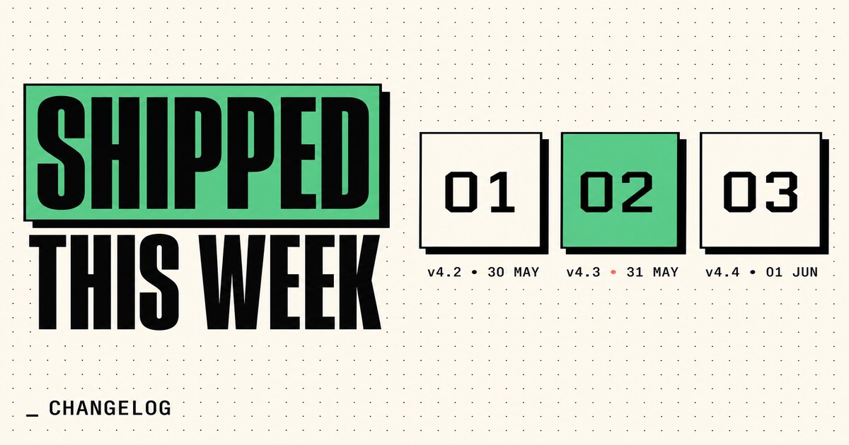
Changelog · shipped this week
For Changelogs & Release Notes
Engineers read changelogs in muscle memory. Neo-brutalist turns that grid into something share-worthy: numbered monospace tiles (01 / 02 / 03), one tile highlighted with a mint block, hard 4px black borders. The format reads as a release page first and a graphic second.
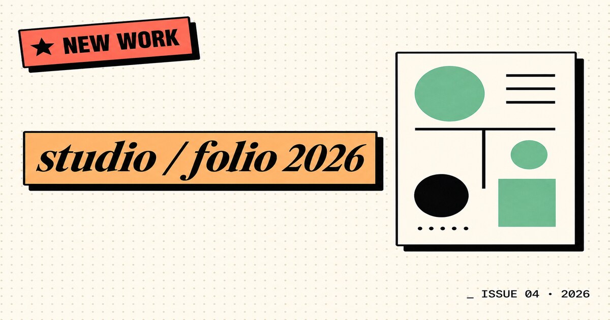
Portfolio · studio / folio 2026
For Indie Portfolios & Studios
Independent studios share work through link previews more than through their actual sites. Neo-brutalist's tilted serif wordmark over a peach highlight bar, plus a hard-shadowed thumbnail card, reads as confident and hand-built. It says "a designer made this" without writing the word designer anywhere.
The Prompts Behind These Four Cards
Each card above started as a one-paragraph prompt. Here are the four we used — paste them into Oginify with your own URL and you'll get the same direction in your brand.
Launch · v3 is live
Generate a 1200×630 Open Graph card in the Neo-brutalist style for a product launch ("v3 IS LIVE"). Cream paper background with a faint dot grid, max-weight black display headline, a coral red highlight block behind the word LIVE, a tilted ★ NEW sticker badge top-right, hard 4px black offset shadow. One bright accent — never two.
Free tool · OG image generator
Generate a 1200×630 Open Graph card in the Neo-brutalist style for a free-tool landing page ("FREE OG IMAGE GENERATOR"). Cream paper, a tilted ★ FREE TOOL peach sticker above the headline, a black mac-window mockup below with coral / peach / mint window dots, hard offset shadow. Friendly, generous, obviously hand-built.
Changelog · shipped this week
Generate a 1200×630 Open Graph card in the Neo-brutalist style for a changelog ("SHIPPED THIS WEEK"). Cream paper with three numbered monospace tiles (01 / 02 / 03), the middle tile filled with a mint green highlight block, hard 4px black borders, small monospace version subtitles ("v4.2 · 30 May"). Engineers should read it as a release page first.
Portfolio · studio / folio 2026
Generate a 1200×630 Open Graph card in the Neo-brutalist style for an indie portfolio ("studio / folio 2026"). Italic serif display wordmark on a peach orange highlight bar, a hard-shadowed thumbnail card on the right, tilted ★ NEW WORK sticker, exposed dot-grid background. Confident and hand-built — no word "design" anywhere.
Neo-Brutalist Style FAQ
When to pick Neo-brutalist over raw Brutalist or Swiss, how it performs across platforms, and how to keep the sticker pop honest without sliding into cluttered cosplay.
When Should I Pick Neo-Brutalist over Raw Brutalist?
Pick Neo-brutalist when the page is friendly, generous or in-product — free tools, onboarding, pricing, changelogs, indie portfolios. Pick raw Brutalist when the page is a manifesto, a launch with attitude, or an indie / underground positioning piece where the card needs to feel anti-corporate.
Can I Swap the Coral / Mint / Peach Accent Colors?
Yes. Neo-brutalist is defined by structure — cream paper, hard offset shadow, one tilted sticker, one highlight block. The accent palette can shift toward your brand color as long as the highlight block stays bright, solid and used once per card.
Will Neo-Brutalist Cards Look Right on LinkedIn?
Yes — better than raw brutalist. LinkedIn's near-white chrome eats pure-white Swiss cards; Neo-brutalist's cream ground holds its edge there. The tilted sticker reads as approachable on a network that punishes overly raw aesthetics.
Is the Sticker-Pop Look Still Legible at Thumbnail Size?
Yes — that's the whole point of the highlight blocks. When the feed downsamples to 600×314 on mobile, the type may soften but the coral / mint / peach blocks behind the headline words stay visible. Brightness wins where weight loses.
One URL. Four Neo-Brutalist Cards.
Paste any page URL and Oginify generates four 1200×630 neo-brutalist cards in seconds — cream paper, sticker pop, A/B-ready, no signup.