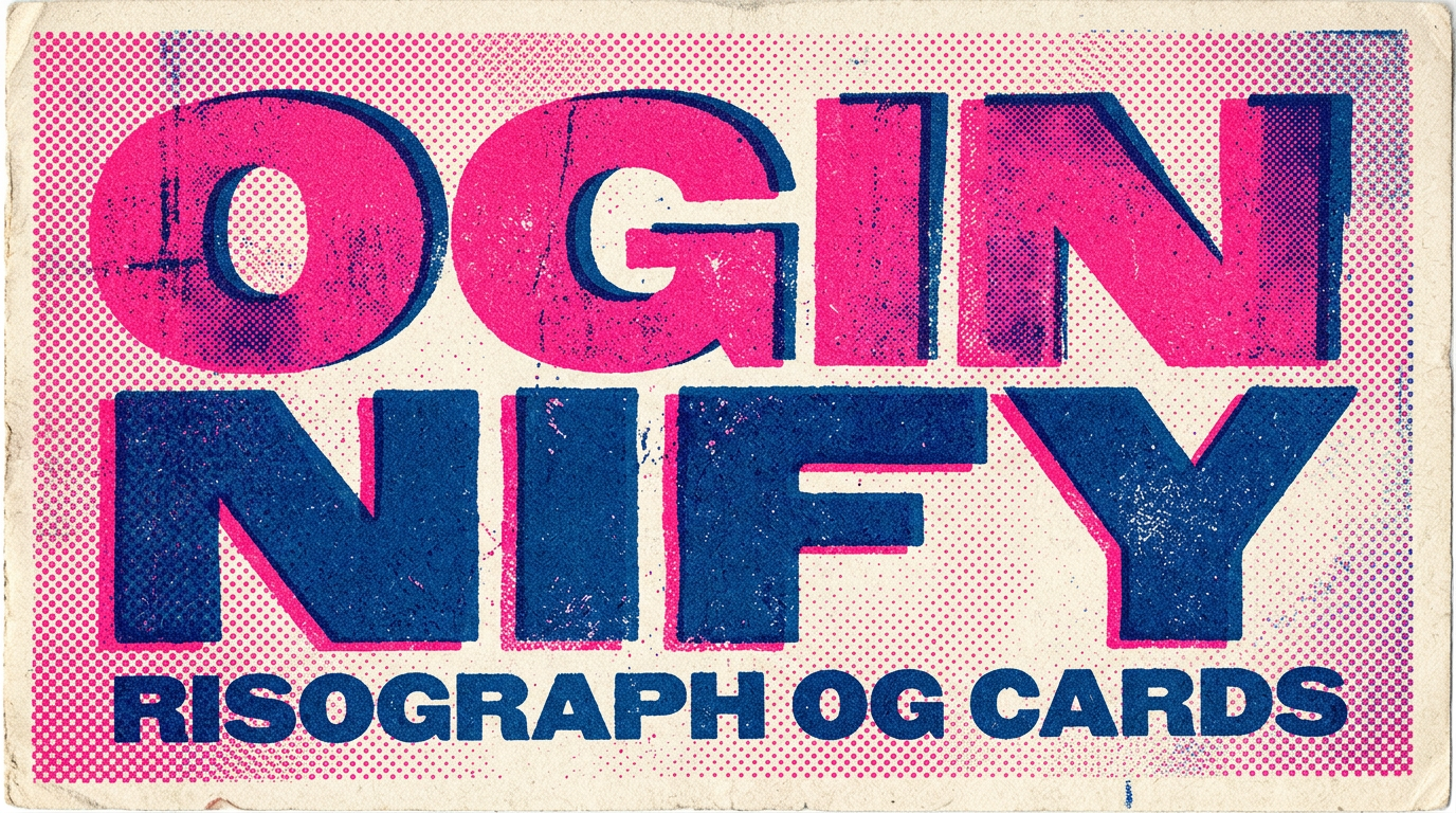
Risograph OG Image Generator
Two or three spot-colour halftones, intentionally mis-registered layers, rough paper grain and chunky display type. The printmaking OG language — for studios, music labels and indie publishers selling on craft.
Why Choose Oginify
Risograph is a printmaking style, not a graphic-design trend — that distinction matters when you're choosing between it and neo-brutalist sticker pop. Below we cover what the two-pass halftone actually does, the studios and labels printing it, and why it lives in a different lane.
Signature Characteristics
Two or three spot-colour passes (fluorescent pink / teal / yellow / federal-blue), each rendered as a coarse 32-60 LPI halftone, layers offset by 4-8px on purpose (the "misregistration" tell), a warm rough-paper background scan, slight ink-roller streaks at the edges, and a chunky display headline — usually a heavy grotesque or a slab serif — sitting on top of the colour passes.
Who Actually Ships It
Wieden+Kennedy's WK Lodge studio runs risograph for client one-pagers. Hato Press and Ditto Press anchor the look for the UK indie scene. Mansions Press, Knust and Risolab Stockholm all ship print-style social tiles. Brain Dead and Stüssy use a softer version on collab launches. Music labels like PAN and Erased Tapes use it on release covers.
Vs Neo-Brutalist
Both feel hand-built, but neo-brutalist is digital-native flat-block stickers (cream paper, hard offset shadow, one accent sticker) while risograph is print-native ink-on-paper (rough scan, halftone dots, mis-registered colour passes). Pick risograph when the brand sells on craft / printmaking / music-label DNA; pick neo-brutalist when the brand sells on shipping product.
Studio · new release
For Studio One-Pagers & Launches
Design studios that sell on craft need share cards that show the craft. A risograph launch card runs a two-pass fluorescent-pink + teal halftone of the product photograph over rough paper, with a chunky grotesque headline — the card reads as a printed studio poster, which is exactly what most studios want their website to be.
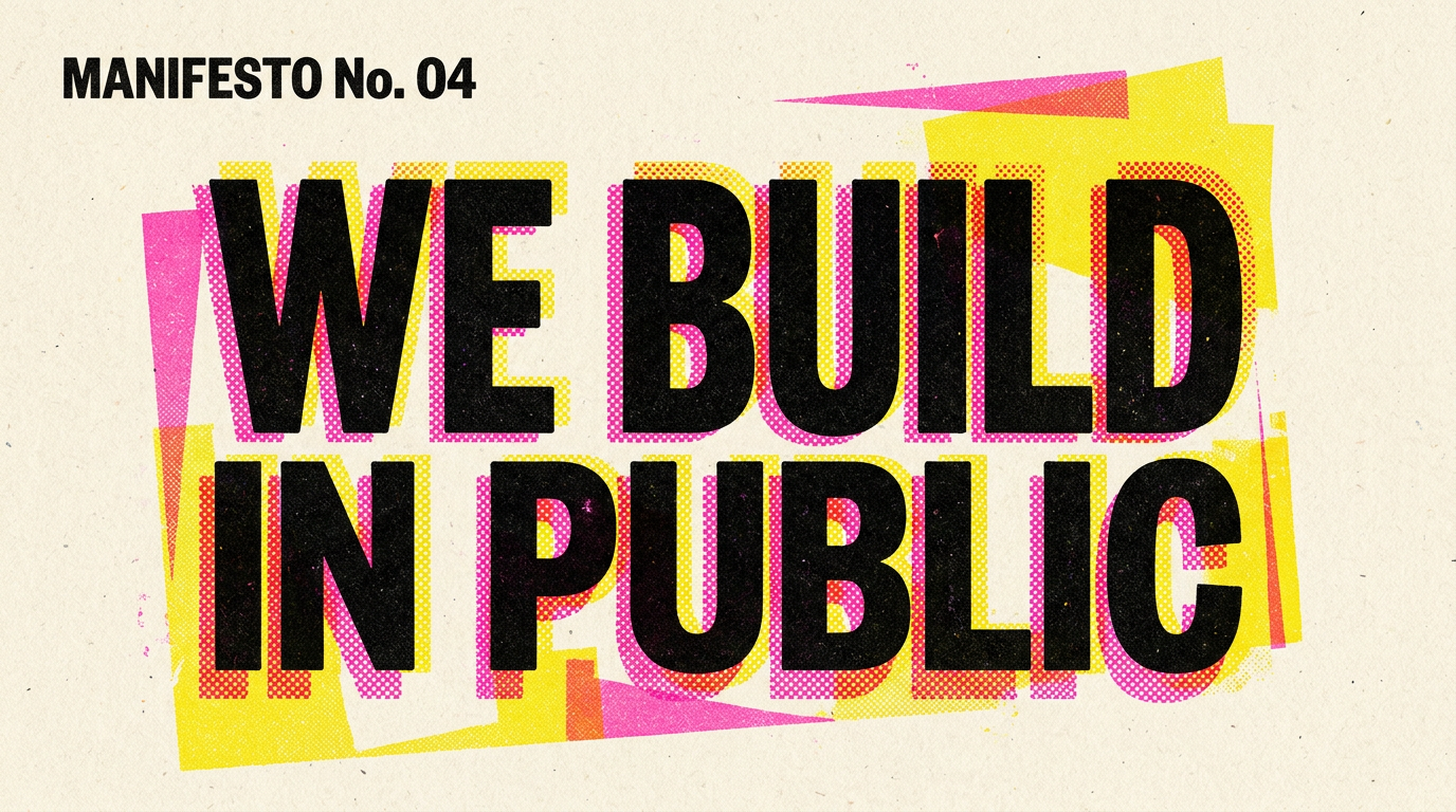
Manifesto · the case for
For Manifestos & Cultural Essays
Cultural essays and printmaker manifestos benefit from a card that shares the medium of the message. A risograph card with a two-colour halftone illustration, deliberate misregistration and a stencil-style headline gives an opinion post the same authority a printed broadside has on a studio wall.
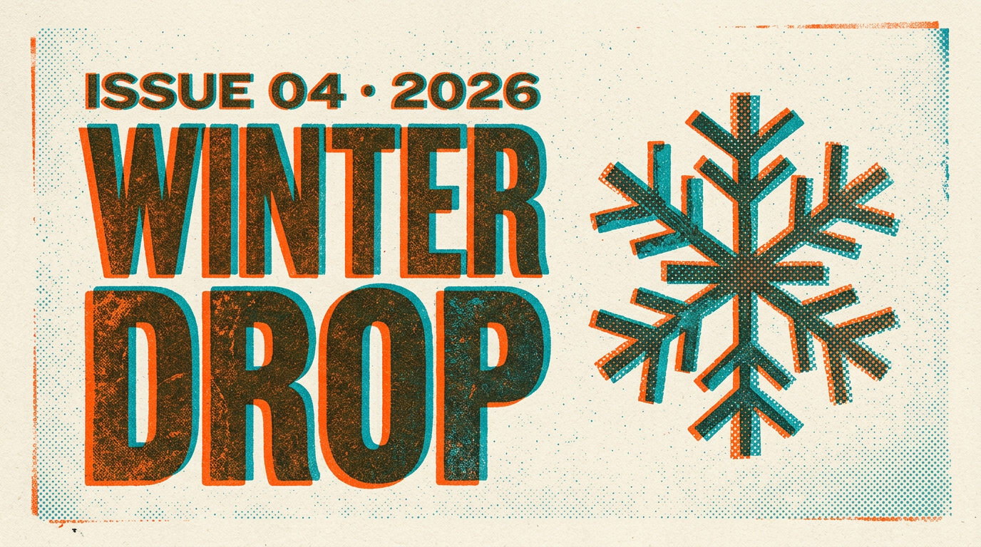
Release · OUT NOW
For Music Releases & Label Changelogs
Independent music labels share releases over feeds where every cover looks the same (square photo + small wordmark). A risograph release card breaks that visual monotony — halftoned cover art, federal-blue overprinted on fluorescent pink, OUT NOW in a heavy slab — and reads as cassette / 7-inch sleeve rather than a streaming tile.
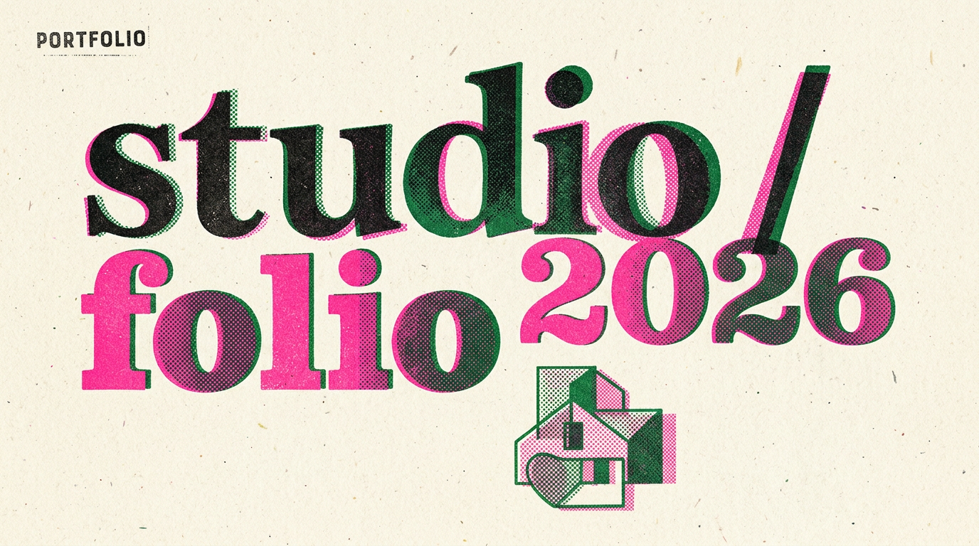
Portfolio · zine vol. 04
For Indie Portfolios & Print Zines
Indie publishers and print-zine portfolios live or die on whether the digital share card matches the printed object. A risograph card — halftoned cover crop, two-colour pass, rough-paper grain, chunky issue number — does that match in a single frame and reads as a zine cover, not a thumbnail.
The Prompts Behind These Four Cards
Each card above started as a one-paragraph prompt. Here are the four we used — paste them into Oginify with your own URL and you'll get the same direction in your brand.
Studio · new release
Generate a 1200×630 Open Graph card in the Risograph style for a studio launch ("NEW RELEASE"). Rough-paper background scan, two spot-colour halftones (fluorescent pink + teal) of the product photograph, layers offset by 4-8px on purpose, chunky grotesque headline overprinting both passes, small monospace studio mark lower-right. Printed-poster tone.
Manifesto · the case for
Generate a 1200×630 Open Graph card in the Risograph style for a manifesto ("THE CASE FOR SHIPPING SMALL"). Rough-paper background, a two-colour halftone illustration (federal-blue + fluorescent pink) with deliberate misregistration, a stencil-style display headline stacked left, small monospace byline. Studio-broadside authority, not blog-post tone.
Release · OUT NOW
Generate a 1200×630 Open Graph card in the Risograph style for a music release ("OUT NOW"). Rough-paper background, halftoned album cover crop, federal-blue overprinted on fluorescent pink, heavy slab-serif OUT NOW headline, monospace catalogue number. Reads as a cassette / 7-inch sleeve, not a streaming tile.
Portfolio · zine vol. 04
Generate a 1200×630 Open Graph card in the Risograph style for an indie zine portfolio ("ZINE VOL. 04"). Rough-paper background, halftoned cover crop in two spot colours, layers offset 6px, chunky issue number, small spine-style mark. Zine cover, not thumbnail.
Risograph Style FAQ
When to pick risograph over neo-brutalist or collage, how the halftone holds up when platforms re-compress the JPEG, and how to keep the misregistration honest without sliding into filter cosplay.
When Should I Pick Risograph over Neo-Brutalist?
Pick risograph when the brand sells on craft, print, music or zine DNA — the card should read as ink-on-paper. Pick neo-brutalist when the brand sells on shipping product — the card should read as a hand-built UI sticker. Both are hand-built, but risograph is print-native and neo-brutalist is digital-native.
Will the Halftone Dots Survive LinkedIn / X JPEG Re-Compression?
Yes, if you keep the halftone at 32-50 LPI (coarse). Fine halftones (80+ LPI) get mangled into noise during platform re-compression. The misregistration helps too — the human eye reads offset colour passes as intentional, even when JPEG smearing softens the dots.
Do I Have to Use Fluorescent Pink + Teal?
No, but two-pass risograph reads strongest with one warm + one cool spot colour. Common pairings: fluorescent pink + teal, federal-blue + yellow, hunter-green + flat-gold, purple + medium-red. Pick two that don't overlap on the colour wheel — that's what gives the overprint a third hybrid colour in the overlap.
Does Risograph Work for AI-Generated Photography?
Yes — better than text overlay or cinematic, because halftoning erases the over-rendered AI tell. The 32-50 LPI dot pattern flattens hyper-smooth skin and synthetic specular highlights into something the eye reads as print. Use it as the salvage style for AI hero shots that look too clean elsewhere.
One URL. Four Risograph Cards.
Paste any page URL and Oginify generates four 1200×630 risograph cards in seconds — two-pass halftone, mis-registered layers, rough paper grain. A/B-ready, no signup.