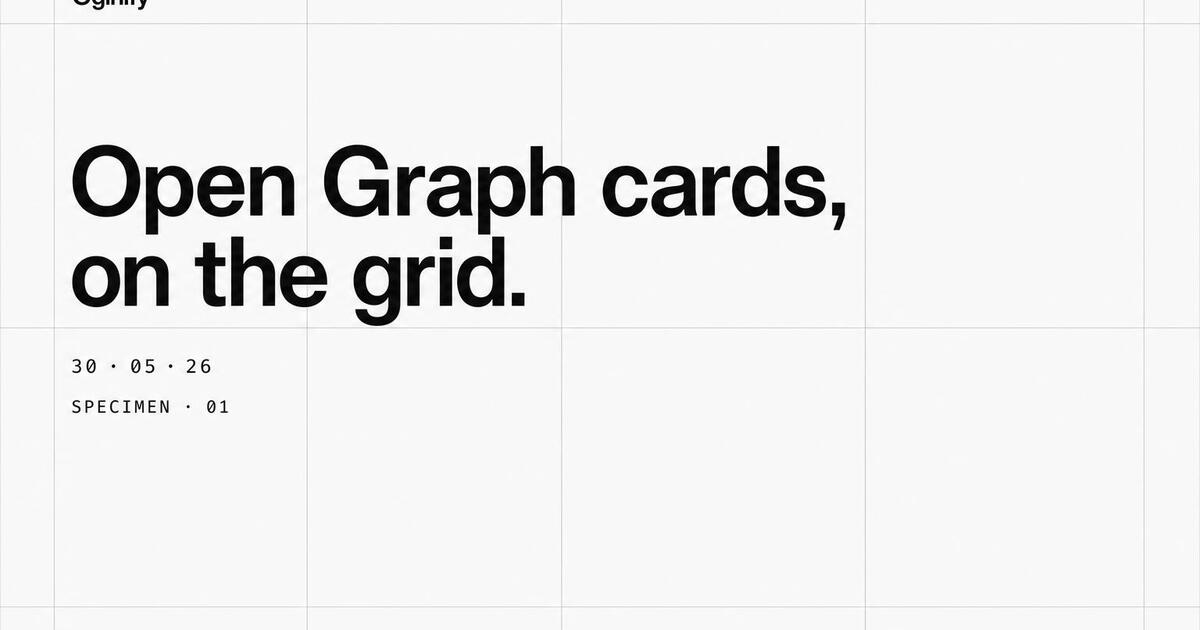
Swiss Style OG Image Generator
Tight grids, generous whitespace, one accent color and a Helvetica-derived sans. Swiss is the safe choice that's actually a strategic choice — the look enterprise buyers, fintech procurement teams and B2B Slack channels read as credible by default.
Why Choose Oginify
Swiss is the safe choice that's actually a strategic choice, and it sits at the polar opposite of terminal even though both lean monochrome. Below: the grid moves that make Swiss read as credible by default, the enterprise brands shipping it, and the line that separates it from a dev-flavored terminal card.
Signature Characteristics
Twelve-column grid as religion. Neue-grotesque sans (Helvetica, Inter, Geist) carrying every weight. White or off-white canvas with generous whitespace. Left-aligned headlines, mono only for meta and labels. Color used sparingly as data, never as decoration. Hairline rules instead of borders. Composition does the work.
Who Actually Ships It
Vercel sets headlines in Geist on a strict grid. Linear's marketing is the textbook modern Swiss site. Stripe's docs and pricing pages turn grid + sans into product clarity. Apple Newsroom keeps the heritage alive at scale. Braun is the analog ancestor every one of these references.
Vs Terminal
Both restrained, both grid-driven, opposite audiences. Swiss is sans on white, content-first, written for everyone — a CFO can read it. Terminal is mono on dark, dev-first, written for engineers — a CFO bounces. Pick Swiss for evergreen marketing, pricing, and brand pages; pick terminal for changelogs, CLI launches, and infra.
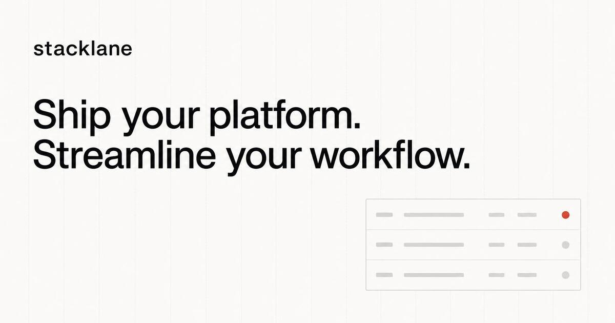
B2B SaaS · stacklane
For B2B SaaS Marketing Pages
B2B SaaS sites need to look credible the first time someone unfurls a link in their team's Slack — before the recipient has parsed a single word. Swiss does that work pre-verbally: grid, whitespace, one accent, a Helvetica-derived sans. The visual vocabulary makes the introduction; the headline only has to confirm it.
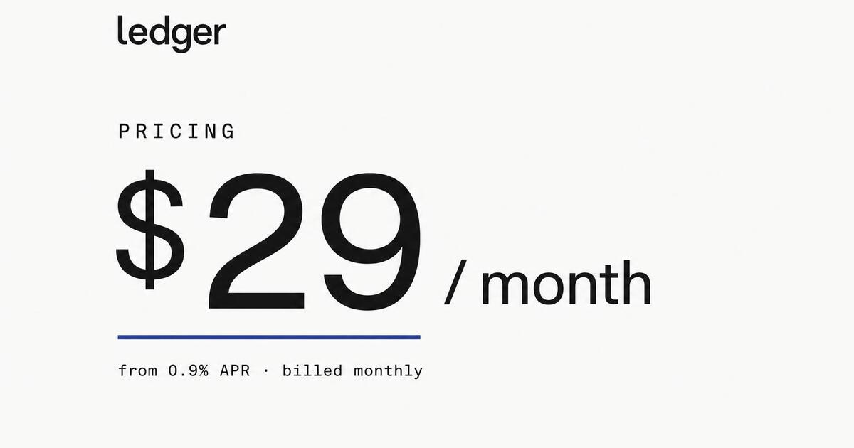
Fintech · pricing
For Fintech & Finance Sites
Fintech buyers are conservative by trade. The card has to telegraph operational seriousness in the unfurl — Swiss does that better than any other preset. Tight grid, monochrome ground, one accent in the brand color, the price chip or APR number set in a clean numerals-aligned figure.
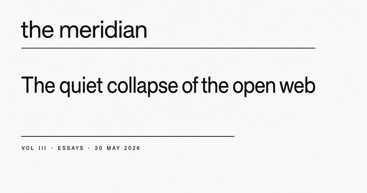
Editorial · The Meridian
For Editorial & Publication Sites
Swiss editorial sits in the publication tradition — Bauhaus, Müller-Brockmann, the Bahnhof. The card uses a heading-and-rule typographic system that reads as a piece of editorial design, not a marketing campaign. Use it for publications whose tone is reportorial rather than promotional.
Comparison · vs
For Comparison & vs Pages
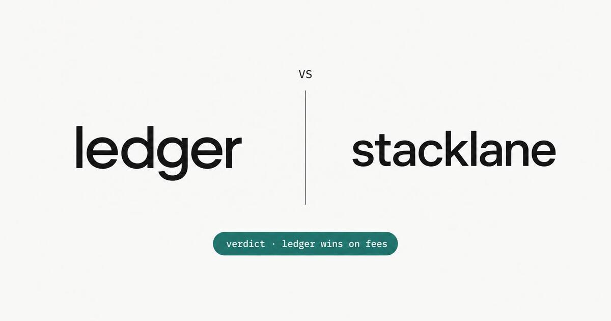
Comparison cards need to look neutral — Swiss is the only preset that lands as neutral by default. Two logos, the same optical weight, a thin rule between them, a small verdict chip below. The card converts because it reads as research, not a hatchet job.
The Prompts Behind These Four Cards
Each card above started as a one-paragraph prompt. Here are the four we used — paste them into Oginify with your own URL and you'll get the same direction in your brand.
B2B SaaS · stacklane.com
Generate a 1200×630 Open Graph card in the Swiss style for the stacklane B2B SaaS marketing page. Disciplined 12-column grid on near-white, brand wordmark top-left, value-prop headline in Helvetica-derived sans, one accent dot on a small dashboard preview. Reads as serious software the moment the link unfurls.
Fintech · ledger / pricing
Generate a 1200×630 Open Graph card in the Swiss style for a fintech pricing page. Monochrome ground, tight grid, aligned numerals on a price chip ("$29 / month"), one accent in the brand color, tiny APR footnote in mono. Operational seriousness at a glance.
Editorial · the meridian
Generate a 1200×630 Open Graph card in the Swiss style for the meridian editorial publication. Heading-and-rule typographic system: masthead top-left, thin rule, large sans headline, dateline + section in small caps. Bauhaus / Müller-Brockmann lineage — reads as a piece of editorial design, not a marketing campaign.
Comparison · vs / verdict
Generate a 1200×630 Open Graph card in the Swiss style for a vs / comparison page. Two brand wordmarks at equal optical weight, a thin vertical rule between them, a small verdict chip ("verdict · ledger wins on fees") below in the accent color. Lands as neutral research, not a hatchet job.
Swiss Style FAQ
When Swiss beats louder presets, how it adapts to a brand that isn't already Swiss, and why it's the right default for B2B.
Is Swiss Too Boring for My Brand?
Swiss isn't boring — it's restrained. Restraint reads as confidence in B2B and fintech audiences who see hundreds of links a day. The card doesn't have to shout to win the click; it has to earn the click. If your brand identity is itself loud, layer it as the accent — but keep the structure Swiss.
What if My Brand Is Already Maximalist?
Then Swiss is the wrong default and you should pick brutalist or magazine. Swiss is for brands that want operational credibility to outweigh personality. If your value prop is creativity, scrappiness or anti-corporate energy, the card should reflect that — pick a louder preset.
Does Swiss Work for the Homepage Card?
Yes — it's the most-used default for B2B homepages specifically. The card reads as a serious company, the wordmark gets the spotlight, and the value-prop headline sits in a typographic hierarchy that respects the reader's time. For DTC, Swiss can feel under-dressed; pick magazine or campaign-mode for those instead.
Will It Look the Same on LinkedIn and Slack?
Yes. Swiss cards survive platform compression better than any other preset specifically because they don't depend on visual effects that compress badly. Black on near-white, one accent, a wordmark — every platform renders that identically.
How Do I Make a Swiss Card Not Look Generic?
The accent color is doing the work. Your brand's specific accent — whether that's Stripe's purple, Notion's gray-tan or Linear's blue-purple — is what makes the card recognizably yours. Oginify reads the brand palette automatically; the only thing you should never do is let the accent slide into a default Swiss red.
Swiss Restraint, Your Brand Color
Paste any URL and get four Swiss-minimal 1200×630 Open Graph cards using your brand palette. No signup.