
CLI
Debut a Tool With Its Own Command Prompt
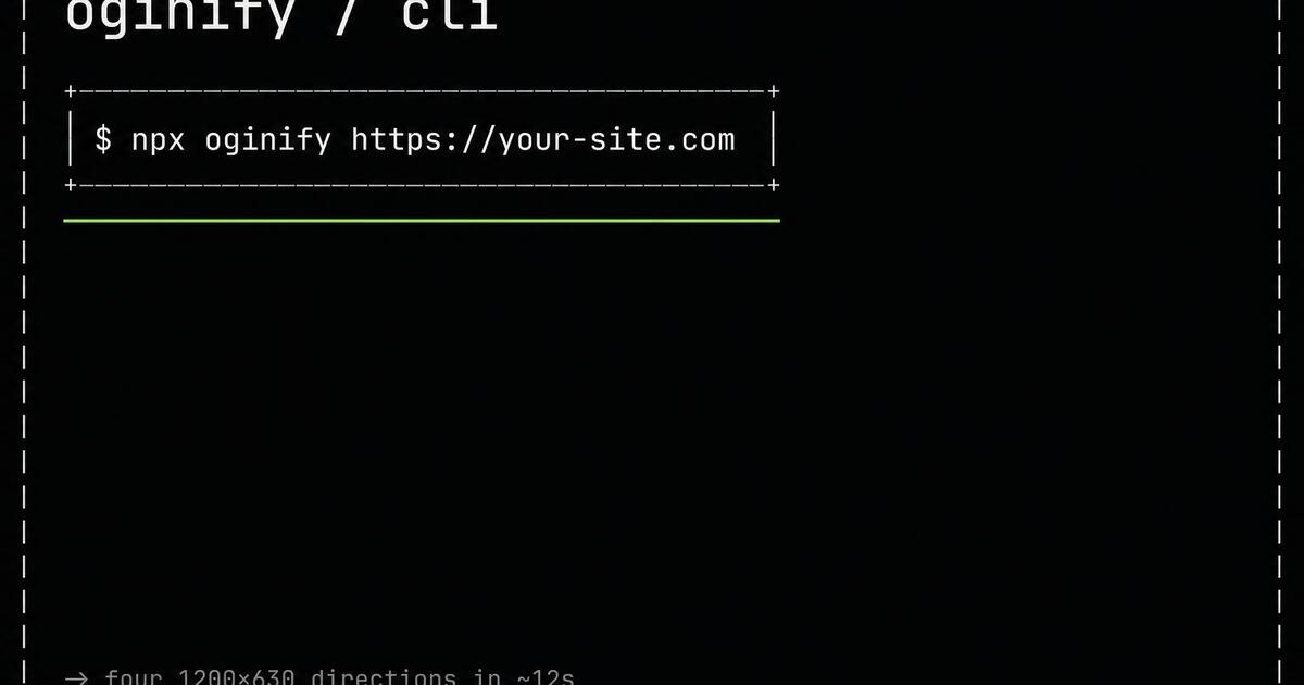
New CLI launching? The card is a terminal frame with the install command set large — the tweet earns the star.
Monospace headlines, a command prompt, an ASCII frame, and a syntax-highlighter accent — the direction that speaks fluent dev and gets shared in the private engineering Slacks.
Terminal cards speak fluent dev — monospace, command prompts, syntax-highlighter accents — and they look almost nothing like Swiss once you put the two side by side. Below: the signature elements, the dev-tool brands shipping them, and why the choice between terminal and Swiss is really a choice of audience.
Dark canvas (near-black or charcoal). Monospace everything — JetBrains Mono, Berkeley Mono, IBM Plex Mono, Geist Mono. One signal accent in terminal green, amber, or cyan. ASCII rules and box-drawing characters as dividers. `$` prompts, blinking cursors, line numbers as gutters. Copy reads like log output, not marketing.
Vercel's CLI and deploy pages use mono + dark as the dev surface. GitHub CLI docs render command output as the hero. Railway's marketing borrows the terminal frame. Cursor's changelog and Fly.io's status pages both speak in mono-on-dark. v0's prompt UI extends the same language.
Both minimal, both grid-driven, opposite tribes. Swiss is sans on white — calm, content-first, written for everyone. Terminal is mono on dark — high-signal, dev-first, written for the engineer who pastes commands. Pick terminal for changelogs, CLI tools, and infra launches; pick Swiss for marketing pages that need to read like Apple, not GitHub.
Docs · API reference
Reference documentation links get DM'd between engineers debugging at 2am. The card needs to land instantly — Terminal does. The endpoint name in mono, the HTTP method as an accent chip, the resource as the prompt result. The recipient knows whether the link is what they need before they click.
Changelog · v4.2
Changelog posts have a specific job — communicate what shipped, when, and to whom. The Terminal preset puts the version in a commit-style chip, the date as a mono timestamp and the shipped feature as the prompt result. Engineers recognize the format immediately; the unfurl earns trust before the click, not because of marketing but because it skips marketing entirely.
OSS launch · forge.dev
Open-source launches live and die on Hacker News and dev Twitter. A Terminal card with the install command on it is doing recruiting before the recipient even clicks — they see the command, they decide they want to try it, the click is already converted. Pair with a clean repo README and the post outperforms.
Engineering · log
Engineering writeups need to read as something a developer wrote in a flow state — Terminal nails that read. Mono headline, accent rule, optional code snippet on the card. The post on Hacker News looks like a 'here's what I learned' deep dive, not a 'we are excited to announce' product blog.
Prompt characters, monospace, the ANSI palette — the treatment reads as built-for-us to any developer skimming a feed.
CLI
New CLI launching? The card is a terminal frame with the install command set large — the tweet earns the star.
Post-mortem
Post-mortems carry weight when the card looks like the terminal the author was in when it happened.
Feature
Vibe-coding platforms shipping developer-first release cards render the feature name as a shell command prompt.
Changelog
Every release note becomes its own terminal card so the version and the change are the whole message.
Terminal cards use monospace type, a shell prompt and a single ANSI-tinted accent — the visual shorthand engineers already read a thousand times a day.
Open with '$ ' or '> ' before the H1; the prompt is what turns a mono headline from decorative to functional in an engineer's eye.
One tint from the standard ANSI 16 — green, cyan or magenta — against dark chrome; picking more than one breaks the terminal reading.
Whatever appears in the frame runs — an actual CLI, a real endpoint, a valid config line. Developer audiences catch fake syntax in one second.
BrutalistSwiss minimalMagazine editorialNeo-brutalistText overlayCinematicCollageRisograph
Terminal and CLI-flavored OG cards with monospace type and ASCII frames.
A visual emulation of a Unix terminal or code editor: monospace type (JetBrains Mono, IBM Plex Mono, Menlo), $ command-line prompts, ASCII box frames, syntax-highlighted code lines, muted color palette (dark background + soft accent). Signals 'technical, dev-friendly, engineering-quality' at first glance.
For CLI tools, developer documentation, API references, OSS project pages, dev-tool releases and any content targeting an engineering audience. Skip terminal for marketing pages aimed at buyers rather than users — the style loses on non-dev audiences who pattern-match it as 'intimidating'.
GitHub for release cards, Cloudflare for docs, Vercel for CLI-related pages, Prisma, Turso, PlanetScale, Neon, Fly.io, Railway, most OSS project landing pages, Warp, most terminal-app companies (obviously). Search their /docs or /releases HTML for og:image.
Real snippets when the source page has them — the generator extracts the hero code block and syntax-highlights it in the card. Falls back to a plausible generated snippet in the page's primary language when no source block exists. Real snippets always land better; source them.
Swiss for the marketing site's homepage and pricing (where non-dev buyers make purchase decisions); terminal for the docs and API pages (where devs live). Most successful dev-tool companies ship both, keyed off the URL — swiss on /pricing, terminal on /docs/*. Same brand, two style zones.
Yes — monospace is designed for legibility at small sizes (it originated on physical terminal screens where every character was a fixed grid cell). Terminal cards actually survive feed-scale rendering better than most styles because every letter has equal horizontal weight.
Paste any URL and get four Terminal-style 1200×630 Open Graph cards built for dev audiences. No signup.