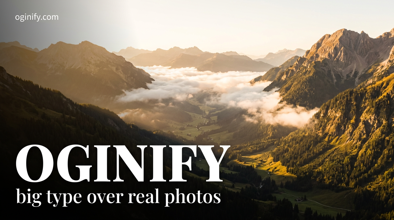
Text-Overlay OG Image Generator
Full-bleed photography, a soft bottom-to-top dark gradient and a max-weight white headline. The most universally readable Open Graph language — works on every platform, every theme, every preview size.
Why Choose Oginify
Text overlay is the most universally readable Open Graph language, and it's a different tool from cinematic colour-grading even though both start with a photograph. Below: the moves that define text overlay, the brands shipping it well, and when to reach for cinematic instead.
Signature Characteristics
Full-bleed editorial photograph at 1200×630, a bottom-to-top dark gradient mask (rgba 0/0/0 0→0.55) anchored to the lower third, max-weight sans-serif headline in pure white sitting on that mask, a small monospace eyebrow line above, optional 24px logo lockup in the lower-right. One headline, one photo, one gradient — never two.
Who Actually Ships It
Vercel runs the cleanest version — dark night photo + giant white wordmark. Linear's marketing pages use text overlay on every changelog. Stripe's product pages anchor the same recipe. Notion uses it on case studies. Figma's Config recap pages live in this language.
Vs Cinematic
Same skeleton — photo plus white type — but text overlay leaves the photo unmodified and lets the gradient mask carry the legibility, while cinematic re-grades the entire photo (teal-orange split-tone, crushed blacks, halftone grain) and treats it as the protagonist. Pick text overlay when the photo is the proof; pick cinematic when the mood is the proof.
Launch · v3 is live
For Product Launches
A launch link wins on the first scroll only if the photo says "new thing exists" before the headline finishes loading. Text overlay anchors a product photo edge-to-edge, drops a soft gradient over the lower third, and stacks a max-weight "v3 IS LIVE" — the card reads as evidence first, copy second.
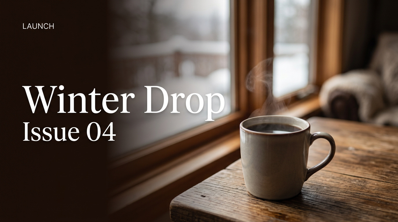
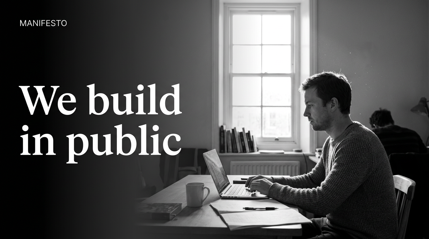
Manifesto · the case for
For Manifestos & Narrative Essays
Long-form essays earn the click when the share card promises a point of view, not a topic. Text overlay over a single, slightly cinematic photograph — sky, hands, an empty office — gives a 4-word manifesto headline the gravity of a magazine cover.
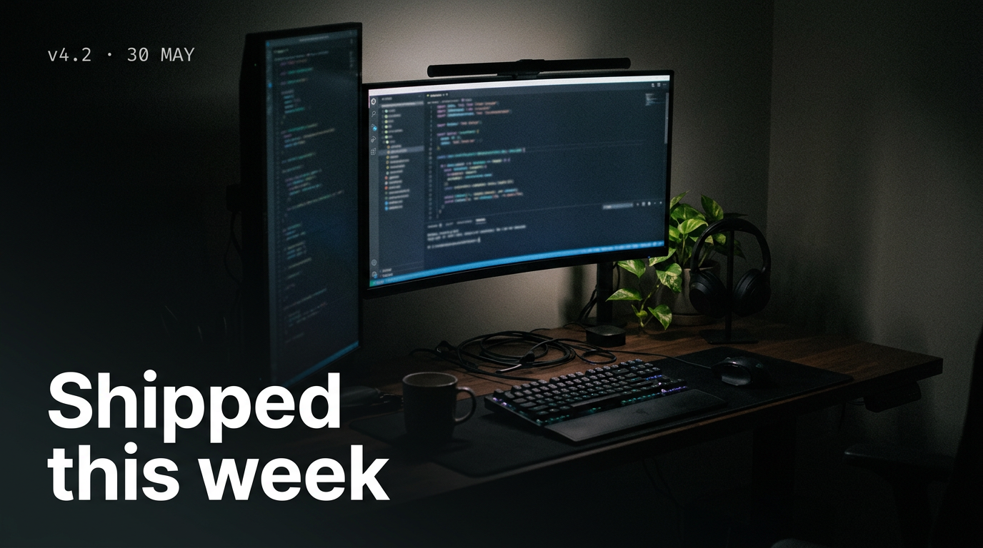
Changelog · shipped this week
For Changelogs & Release Notes
Engineers scan changelog cards in feeds. A product screenshot photographed on a real desk, dimmed by the gradient, and topped with a monospace eyebrow + bold version headline reads as a credible release page in a single glance — far more trustworthy than a synthetic 3D render.
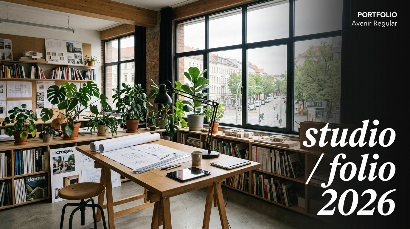
Portfolio · selected work
For Portfolios & Case Studies
Independent designers and studios live or die on share previews. Text overlay over a single hero shot of the work — installation, screen, object — plus a 2-word headline lets the work itself do the persuading. The card is a contact sheet, not a sales asset.
The Prompts Behind These Four Cards
Each card above started as a one-paragraph prompt. Here are the four we used — paste them into Oginify with your own URL and you'll get the same direction in your brand.
Launch · v3 is live
Generate a 1200×630 Open Graph card in the Text-overlay style for a product launch ("v3 IS LIVE"). Full-bleed editorial product photograph, bottom-to-top dark gradient mask anchored to the lower third, max-weight sans-serif headline in pure white sitting on that mask, small monospace eyebrow "LAUNCH · v3.0" above. One headline only.
Manifesto · the case for
Generate a 1200×630 Open Graph card in the Text-overlay style for a manifesto essay ("THE CASE FOR SHIPPING SMALL"). Atmospheric editorial photograph — empty office, golden hour sky or hands on a keyboard — soft bottom-to-top dark gradient, white display headline anchored lower-left, small monospace byline. Magazine-cover gravity, no logo lockup.
Changelog · shipped this week
Generate a 1200×630 Open Graph card in the Text-overlay style for a changelog ("SHIPPED THIS WEEK"). Photograph of a product UI on a real wooden desk, soft dark gradient mask, monospace eyebrow "CHANGELOG · v4.2 · 30 May", max-weight white headline. Credible release-page tone, no synthetic renders.
Portfolio · selected work
Generate a 1200×630 Open Graph card in the Text-overlay style for a portfolio page ("SELECTED WORK 2026"). Single hero shot of the work — installation / product / screen — soft dark gradient anchored bottom-left, minimal 2-word white display headline, small monospace studio name lower-right. Contact-sheet calm.
Text-Overlay Style FAQ
When to pick text overlay over cinematic or brutalist, how the gradient stays legible across platforms, and how to keep the photo doing the work without sliding into stock-photo flatness.
When Should I Pick Text Overlay over Cinematic?
Pick text overlay when the photo itself is the proof — a real product on a real desk, a real installation, a real face. The gradient adds legibility without altering the image's truth. Pick cinematic when the mood matters more than the literal subject (manifestos, brand stories, anniversary recaps) and re-grading the image is part of the message.
Will the Gradient Mask Stay Legible at Linkedin's 600×314 Thumbnail Size?
Yes — the gradient is anchored to the lower third and the headline sits inside the densest part of it, so even when the platform downsamples and re-compresses the JPEG the white type holds its edge. The risk is reversed for photos where the lower third is already bright; in those cases lengthen the gradient up to the lower half.
Can I Add a Logo / Wordmark Lockup?
One lockup, lower-right, ≤24px equivalent, ≥50% opacity reduction so it never competes with the headline. Text overlay is a one-headline-one-photo recipe — any second focal point dilutes the card. If you need to identify the brand more strongly, run cinematic instead and put the wordmark in the safe zone.
Does This Style Work for AI-Generated Photos?
Yes, as long as the AI shot reads as photographic — depth of field, real grain, slightly imperfect framing. Hyper-rendered 3D scenes break the convention because the gradient mask was designed to land on a photograph, not on a synthetic surface. If the source is 3D, use cinematic to re-grade it into photographic territory first.
One URL. Four Text-Overlay Cards.
Paste any page URL and Oginify generates four 1200×630 text-overlay cards in seconds — full-bleed photo, dark gradient mask, max-weight white headline. A/B-ready, no signup.