
TL;DR
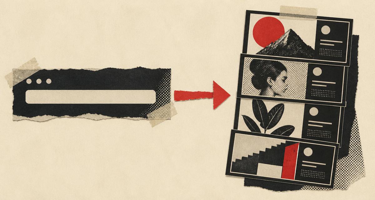
- The 2026 way to create an Open Graph image is to paste your URL into an AI generator like Oginify, which reads your page's brand, palette, and headline and produces four 1200×630 variants in about thirty seconds — no design tool needed.
- The manual way still works: design at 1200×630 in a tool like Figma or Canva, keep the headline readable at thumbnail size, export PNG, host it publicly, and add the `og:image` meta tag.
- Every card needs three things: 1200×630 pixels (1.91:1), a headline that survives compression, and an absolute, public HTTPS URL.
- Test before you trust: social platforms cache Open Graph metadata aggressively, so use the platform debugger or a validator to confirm the crawler sees your card.
- Skip the tags at your peril: without `og:image`, platforms guess — a random page image, a grey placeholder, or a plain-text link.
Most tutorials on creating an Open Graph image assume you are going to design it yourself — open a canvas, pick a template, export a 1200×630 PNG, upload it, and write the tags. That workflow still works, but in 2026 it is no longer the only one, and for most people it is not the fastest. The newer path collapses the whole thing into one step: paste your page's URL into an AI generator, get four brand-matched 1200×630 variants in about thirty seconds, pick one, and drop the ready-made meta tags into your page head. This guide walks both paths honestly — the manual route for when you want a bespoke design, and the AI route for when you want a good card now — then covers the testing step that every tutorial skips.
The honest framing is a two-path choice, not a contest. If you need one carefully art-directed card and you have the time, the manual path gives you full control. If you need a card for a blog post, a product page, or a launch — and you need it this afternoon — the AI path removes the design bottleneck entirely. What both paths share is the finish line: a strict 1200×630 PNG at a public URL, declared in your page's Open Graph metadata, and verified in a debugger.
1. What most people get wrong about Open Graph images
The first mistake is treating the Open Graph image as a technical chore rather than a brand surface. The og:image tag is one of the four required Open Graph properties — alongside og:title, og:type, and og:url — and it is the only one that carries an actual visual asset, per the Open Graph protocol. It is the image that appears next to your link on X, LinkedIn, Slack, Discord, WhatsApp, and iMessage, and it renders largely unchanged everywhere. Skipping it means platforms fall back to guessing, which is how shared links turn into grey boxes and random hero-image crops.
The second mistake is assuming the design has to be elaborate. The best Open Graph images are simple: a clear headline, a short supporting line, strong contrast, and a background that does not compete with the text. FeatureImg's own guide, which ranks first for this query, is explicit that the headline is the strongest element and should stay readable at thumbnail size, and that busy photos behind small type fail the squint test. The card is usually displayed around 300px wide on mobile feeds, so every element you add is an element fighting for space.
The third mistake is forgetting that the card is per-page, not per-site. A static site-wide logo card tells every reader "this is a template, not a page," and it is exactly what a blog with forty posts ships when nobody builds forty images. That is the gap the 2026 AI workflow exists to close: per-page cards at per-page effort. If you are new to what these images are and why they matter, our guide to what an Open Graph image is covers the protocol, the size, and the mechanics in depth.
2. The manual path — design, export, host
The manual path is the one every tutorial teaches, and it is worth understanding even if you end up using AI, because it explains what the generated card is actually doing. Start with the page title: the title should be the strongest element in the image, shortened from the full CMS headline if necessary so it stays readable at thumbnail size. Add one short supporting line if the title alone is too broad — a single line, not a paragraph. Choose a layout that matches the content type: a blog post gets headline plus subtitle on a simple background, a product launch gets product name plus a value line, a comparison gets the X vs Y structure with names only.
Design on a 1200×630 canvas at a 1.91:1 ratio, which is the large-card size that X, LinkedIn, Slack, Discord, Facebook, and iMessage all render. Keep the message centered or clearly anchored, leave margin away from the edges because platforms crop, and zoom out before export to check thumbnail readability. Export as PNG or JPEG — PNG for text-heavy images, JPEG for photographic ones — and keep the file under a few MB so it loads fast, per the Peasy CSS guide. Host the file at a public HTTPS URL, then point your page's metadata at it. The full set of tags looks like this:
<meta property="og:image" content="https://yourdomain.com/og-image.png" />
<meta property="og:image:width" content="1200" />
<meta property="og:image:height" content="630" />
<meta property="og:image:alt" content="A summary of what the card shows" />
Most CMS and site builders expose the same setting as a "social image" or "OG image" field, so you may not need to touch markup at all. The manual path gives you total control over the design, and for a single carefully crafted card it is the right call. Its cost is time: forty posts means forty design sessions, which is exactly why most sites ship one generic card instead.
3. The 2026 AI path — paste a URL, ship a card
The AI path exists because the manual path's bottleneck was never the tag — it was the design work. The 2026 workflow collapses the design step into a single input: your URL. A URL-first generator like Oginify fetches your page, reads the title, description, primary color, and logo, and paints four 1200×630 cards — one on-brand and three creative wildcards in editorial, terminal, and Swiss-minimal directions — in about thirty seconds, with no prompt, no template picker, and no signup, exactly the flow the Oginify homepage runs. You pick whichever variant wins on click-through, download the PNG, and paste the ready-made Open Graph and Twitter Card tags into your page head.
The mechanism matters because it solves the per-page problem directly. Every card is generated from the actual page it represents, so a blog with forty posts can ship forty distinct, on-brand cards in an afternoon — each one matching its page's real palette and headline rather than a generic template with your logo dropped on top. The pricing matches the one-off job: the free tier covers a handful of cards per day, and beyond that you pay per card with no subscription and credits that never expire, per the Oginify pricing page as of August 2026.
If you already live inside a general-purpose image model — Gemini, GPT Image, or Midjourney — those can absolutely paint a card too, and they are capable of beautiful results. The trade-off is the same one every prompt-driven tool carries for this specific job: you must specify the 1200×630 ratio in the prompt, verify the text renders legibly (the headline is most of the image), export, host, and write the tags yourself. For a single bespoke image that is fine; for per-page cards across a site, the URL-first path is shorter. For a full ranked comparison of the URL-first, prompt-driven, and code-driven options, our best AI open graph image generators guide lays out the trade-offs.
4. Testing before you publish
This is the step most tutorials skip, and it is where broken cards actually get caught. Social platforms cache Open Graph metadata aggressively, so if you change a tag and still see the old preview, that is the cache, not a bug. After you publish, run the URL through the platform's own debugger — Meta's Sharing Debugger, X's Card Validator, LinkedIn's Post Inspector — or through a validator that fetches your page the way a crawler does. The goal is to confirm that the crawler sees exactly the card you intend: the right image, the right dimensions, and a descriptive og:image:alt.
The other thing to verify is accessibility of the URL itself. The image must be publicly fetchable without authentication — no signed URLs, no basic auth, no localhost paths — because social crawlers do not log in. A quick check: paste the image URL into an incognito window. If it loads, a crawler can fetch it too. Our Open Graph validator reads your live page the way a platform would, which is a faster loop than opening four separate debuggers.
The cache is also a reason to get the first card right. A grey placeholder that has been shared for months has accumulated real impressions, and replacing it is a small but visible brand win. Design, host, declare, verify — and then let the platforms cache the good version.
5. What your card should look like
Whether you design manually or generate with AI, the finished card should pass the same tests. The headline should be readable at thumbnail size — short, bold, high-contrast, and the strongest element in the frame. The topic should be clear without opening the page, because the card is the first impression a scanner sees. The layout should be uncluttered: no paragraphs, no URLs, no dense UI screenshots, no tiny logos doing the work of a headline. And the design should match the page it represents — a card that contradicts the article title is worse than no card.
The visual hierarchy rule is simple: most important information top-center, because some platforms crop the bottom of cards. Keep text to a headline and one supporting line, use a solid color or simple gradient rather than a busy photo behind small type, and include your brand name or logo small enough to identify without competing. A card that passes these tests works at 300px wide on mobile and at full size on a desktop feed. The same criteria apply to every card you generate with AI — the four variants a URL-first tool returns are exactly this trade-off in four directions, and the one that wins is the one that survives a small screen.
Consistency is the part most people underrate. A single strong card is a one-off; a site where every card carries the same palette, the same typography, and the same layout rhythm is a brand. When you generate cards per page, check the four variants against each other as a set rather than in isolation — the wildcard that is striking on its own may clash with the card next to it in a feed. The practical rule is to pick one direction (editorial, terminal, or Swiss-minimal) as your site's default and reserve the others for launches, so the brand reads as coherent across an afternoon of shared links rather than as four different companies.
Conclusion
Creating an Open Graph image in 2026 is a two-path choice. The manual path — design at 1200×630, export, host, declare — still gives you total control for a single bespoke card. The AI path — paste a URL, pick a variant, ship the tags — removes the design bottleneck that kept most sites on one generic card. Both end at the same finish line: a strict 1200×630 PNG at a public HTTPS URL, declared in your metadata, and verified in a debugger so the cache serves the card you actually want. What you no longer have an excuse for is shipping a grey placeholder.
Paste your page's URL into Oginify and you will have four on-brand card variants in about thirty seconds — no signup required for the free daily quota. Before you publish, run your existing tags through the Open Graph validator to see exactly what your links look like today.