
Market entry
Debut a Product to Chinese Users
The mainland launch card carries a Simplified Chinese headline with correct kerning and a wordmark tuned for QR-heavy feed thumbnails.
Punctuation gets clipped, headlines lose air, brand colour turns garish — Oginify treats 中文 as a first-class typographic system so every card breathes on WeChat and beyond
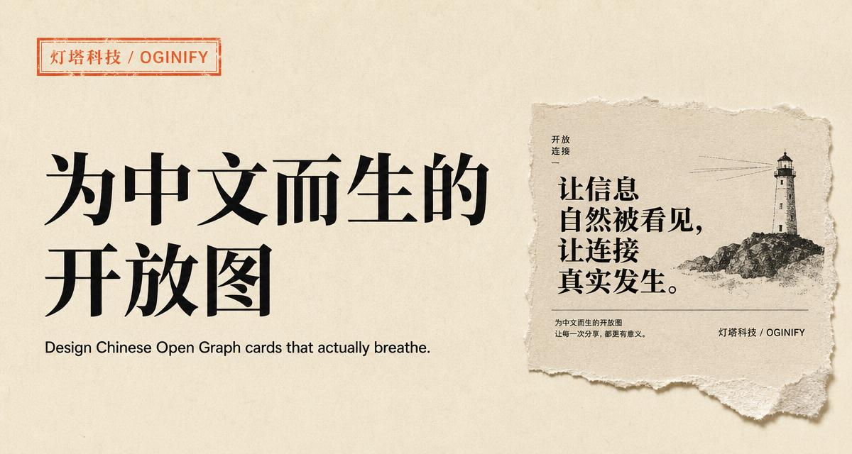
Built for the way Chinese teams actually publish — real CJK fonts, correct punctuation and a color system that survives WeChat and Weibo compression.
Every card ships with genuine 思源宋体 and 思源黑体 subsetted per page — not a Western fallback that reflows CJK glyphs into half-width boxes.
Full-width commas, quotation marks and dashes stay full-width; ellipsis stays as ⋯; Latin words inside Chinese sentences pick up the right spacing automatically.
Brand names like Oginify, GitHub or React sit next to 中文 headlines without falling back to a mismatched sans — the mixed baseline stays flat.
WeChat downsamples cards to 383×191 and JPEG-crushes color. The Chinese preset uses oversized display type and one vermillion anchor so the headline still reads at thumbnail size.
Toggle between 简体 and 繁體 per page. The layout stays the same; only the glyph set swaps, so mainland and Taiwan/HK teams share one design system.
Vermillion (#C43E1C) reads as an editorial stamp against ink black, not as an alarming red. Contrast is tuned for dense Chinese type at small sizes.
SaaS · Landing page
Most Chinese SaaS teams paste an English template and translate the copy — headlines pile up, line-heights collapse, the CTA red turns garish. Oginify rebuilds the layout in real Source Han Sans / Serif so headline, subhead and CTA each breathe on WeChat, Feishu and X.
Editorial · Weekly newsletter
WeChat downsamples article covers to 383×191 and Weibo goes smaller — a one-line headline can turn to mush. This layout leans on oversized Source Han Serif for the main title, italic Song for the subhead, and one vermillion date stamp so the card still reads at thumbnail size.
E-commerce · Seasonal drop
Chinese DTC cards on Taobao, Xiaohongshu and WeChat lose full-width commas, reset prices to serif Latin and crop product photos wrong. Oginify auto-switches to tabular numerals, preserves CJK punctuation and crops the shot to the 1200×630 golden ratio.
Devtool · Chinese docs
The classic failure on Chinese devtool sites is a monospace face that half-width-crushes Han glyphs while comments fall back to a mismatched serif. This layout assigns Source Han Sans to Chinese comments and JetBrains Mono to code, keeping line-height aligned across the mixed run.
The domestic web runs on WeChat, Xiaohongshu and Zhihu. The card should read cleanly inside those previews, not lean on English defaults.
Market entry
The mainland launch card carries a Simplified Chinese headline with correct kerning and a wordmark tuned for QR-heavy feed thumbnails.
Xiaohongshu
Xiaohongshu previews the OG image before the note body — a Chinese headline earns saves that an English card never would.
36Kr
Tech journalists pasting the URL into a CMS expect a preview that already reads in the article language, not a machine-translated approximation.
Docs
Chinese-language docs deserve Chinese-language OG — the pattern is one of many on the use cases overview.
Chinese OG cards need character-density awareness, native font selection and headlines built for square-glyph reading — not translated Latin templates.
Source Han Sans, Noto Sans SC or a licensed foundry face — never fall back to a Latin font with a CJK 'auto' add-on; the mismatch reads immediately.
Chinese glyphs are square, so line-height and tracking rules from Latin type do not port; open leading to 1.35 and drop tracking to zero.
Manual line breaks at semantic phrase boundaries beat automatic word wrap; a two-character orphan on line two ruins the whole composition.
Chinese Open Graph specifics — fonts, punctuation, and how WeChat unfurls a shared link.
Source Han Serif (思源宋体) and Source Han Sans (思源黑体) — both released by Adobe + Google under the SIL Open Font License, free for commercial use. We subset per page so the card renders even when the reader's device has no Chinese font installed.
32–48px equivalent — noticeably larger than the same headline in English. Chinese characters carry more visual weight per glyph and downsample worse on WeChat (383×191) and Weibo (200×200). The Chinese preset defaults to 44px display for the main headline.
Yes on WeChat article shares (they read og:image and og:title from the page head) and Weibo link cards. 小红书 does not read Open Graph — you upload the 1200×630 PNG directly as the cover image. Oginify exports the same file for both flows.
Write the headline as you'd type it — 使用 Oginify 生成 OG 图. The renderer detects CJK vs Latin runs and applies the right font per run, so 思源黑体 and Inter share one baseline without the usual half-width collapse.
Yes. Set the language tag to zh-Hant and the renderer swaps to Source Han Serif TC / Sans TC while keeping the layout identical. One template ships mainland (zh-CN), Taiwan (zh-TW) and Hong Kong (zh-HK) variants.
Paste any Chinese URL — real 思源宋体 / 思源黑体 typography, correct punctuation, brand color, and 1200×630 output in seconds.