
Market entry
Debut a Service to Japanese Users
The JP launch card sets the headline in Noto Sans JP with kanji-kana rhythm that reads naturally on Twitter and note.com previews.
Half-width punctuation, kana that collapses on line breaks, headlines with no air — Oginify treats 日本語 as first-class so every card lands with editorial calm on X and LINE
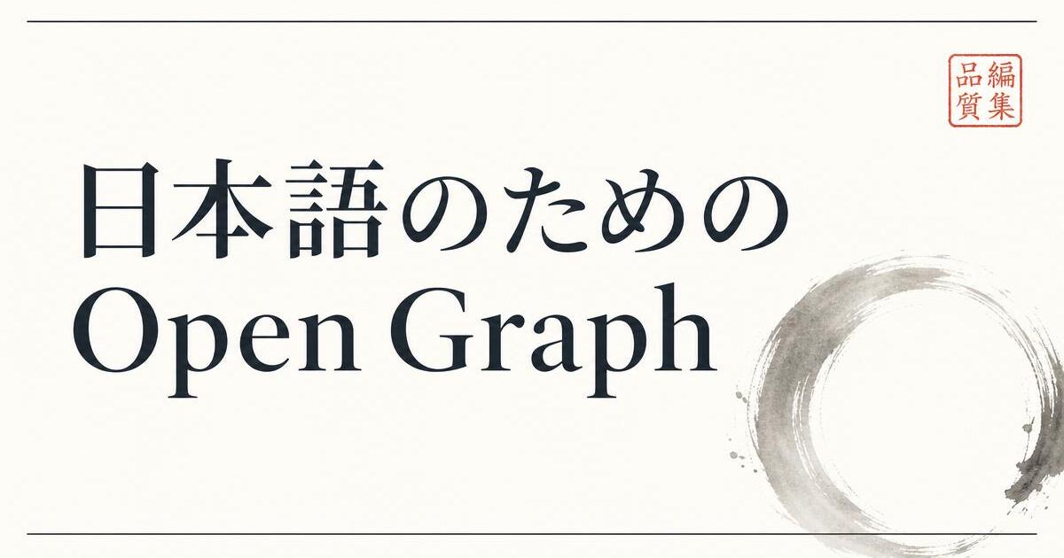
Every card ships with genuine Noto Sans JP and Noto Serif JP subsetted per page — not a Western fallback that turns kanji into tofu boxes or half-width forms.
Full-width 、and 。 stay full-width; ・ middle dots preserved; ellipsis stays as ⋯; Latin words inside Japanese sentences pick up the right thin space around them.
Brand names like Oginify, GitHub or React sit next to 日本語 headlines without breaking the baseline — kanji, hiragana and Latin runs share one visual grid.
LINE previews crop cards aggressively and Zenn re-renders them at small sizes. The Japanese preset uses oversized display type and one seal-stamp accent so the headline still reads at thumbnail size.
Layouts respect the classical top-to-bottom reading rhythm even in horizontal cards — dates and small labels sit where a Japanese editor expects, not where a Western template guessed.
Ready-made presets for note magazine masthead, Zenn dev-post covers and Qiita article cards — each with the right density, hairline rules and one-color accent.
SaaS · Landing page
Japanese SaaS pages built from translated English templates squash headlines, drop half-width punctuation and let CTAs shout. Oginify rebuilds the layout in real Noto Sans JP and Noto Serif JP so the three tiers — display, subhead, CTA — each breathe.
Editorial · Long-form newsletter
note covers are 1280×670 and LINE crops them further — a single-line headline can vanish. This layout uses oversized Noto Serif JP for the masthead, italic Serif JP for the subhead and a single vermillion seal-stamp so the card still reads at fingernail size.
E-commerce · Seasonal drop
Japanese e-commerce cards shared on Rakuten, Instagram and LINE Official swallow full-width punctuation, flip prices into Latin faces and warp product photos. Oginify switches to tabular numerals, preserves full-width marks and crops the shot to the 1200×630 golden ratio.
Devtool · Japanese docs
The classic failure on Japanese devtool sites is a monospace face that half-width-crushes kanji while comments fall back to Mincho. This layout assigns Noto Sans JP to Japanese comments and JetBrains Mono to code, keeping baselines aligned across the mixed run.
Japanese design conventions expect tight vertical rhythm and considered kanji-kana balance. The card should honor both.
Market entry
The JP launch card sets the headline in Noto Sans JP with kanji-kana rhythm that reads naturally on Twitter and note.com previews.
Note.com
Note posts syndicated across Twitter and Facebook rely on the OG for the first impression — a Japanese card lands, an English one bounces.
TechCrunch JP
JP tech press pasting the URL expects the card to carry the story in Japanese — the pattern belongs in the broader use cases index.
Docs
JP docs pages need JP OG cards — the section H1 set clean, subhead intact, wordmark tucked into the right corner.
Japanese OG cards mix kanji, kana and Latin loanwords — the type system has to hold three scripts at once without any of them looking apologized-for.
Noto Sans JP, Hiragino Sans or Yu Gothic — families that draw kanji, kana and Latin as one design system, not as fallbacks glued together.
Kanji carry more visual mass than kana; drop kana one weight lighter or increase kanji tracking slightly so the line reads at even color.
Katakana loanwords and Latin brand names look correct at ~90% of the surrounding size; matching them 1:1 makes them shout in the composition.
Noto Sans JP and Noto Serif JP — both released by Google + Adobe under the SIL Open Font License, free for commercial use. We subset per page so the card renders even when the reader's device has no Japanese font installed.
36–52px equivalent — noticeably larger than the same headline in English. Kanji carry more visual weight per glyph and downsample poorly on LINE and Zenn thumbnails. The Japanese preset defaults to 46px display for the main headline.
Yes on X, Zenn and note — they all read og:image and og:title from the page head. LINE reads them too when the URL is shared into a chat. For LINE Official Account rich messages you upload the 1200×630 PNG directly; Oginify exports the same file.
Write the headline as you'd type it — 「Oginify で OG 画像を生成」. The renderer detects CJK vs Latin runs and applies Noto Sans JP or Inter per run, so kanji, kana and Latin share one baseline without the usual half-width collapse.
The 1200×630 canvas is horizontal, so full vertical typesetting isn't the goal — but the Japanese presets keep the editorial rhythm of 縦組み (date stamps, side labels, hairline framing) so the card still reads as Japanese, not translated Western.
The renderer uses full-width kana by default and preserves half-width only when the source URL uses it. Legacy Shift-JIS pages are fetched, normalized to UTF-8, and rendered correctly — no mojibake in the output card.
Paste any Japanese URL — real Noto Sans JP / Serif JP, correct punctuation, one seal-stamp accent, and 1200×630 output in seconds.