
Market entry
Debut a Product to Brazilian Users
The BR launch card carries a Portuguese headline with correct accents, set in a face that handles the diacritics cleanly on WhatsApp.
Accents drop, cedillas mutate, long compound words snap mid-line — Oginify treats Português as its own typographic system, PT-BR and PT-PT both, so titles land whole on the timeline
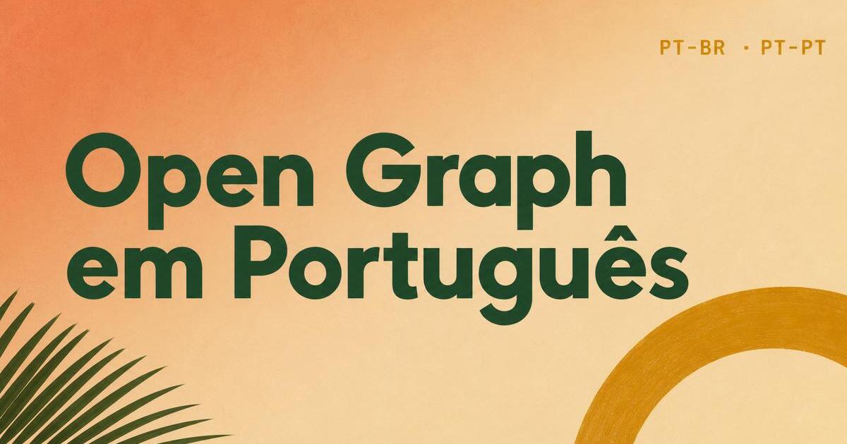
Built for the Portuguese-speaking web — accents, cedillas, long compounds and PT-BR/PT-PT tone all handled on the same 1200×630 canvas.
Á, é, í, ó, ú, ã, õ, ç, à — every glyph renders correctly, never a fallback box. Each card is subset with the exact characters that appear in the headline.
Toggle the voice between Brazil and Portugal per page. Layout stays identical; only vocabulary swaps (celular vs telemóvel, cadastro vs registo), so teams on both sides share one design system.
Long words like desenvolvimento, compartilhamento or responsabilidade break on syllable boundaries, not mid-glyph — no crooked ‘desenvolvi-mento’ at the top of the card.
R$ 1.299,90 and € 249,00 align in tabular figures — the Portuguese decimal comma and thousand separator are respected, never forced into English formatting.
WhatsApp and Instagram compress cards and re-encode aggressively. The Portuguese preset uses oversized display type and one mustard accent so the headline stays legible at thumbnail size.
Presets inspired by Brazilian editorial magazines and contemporary Portuguese graphic design — warm geometry, forest green and mustard instead of generic corporate blue.
SaaS · Landing page
Portuguese SaaS pages built from translated English templates drop accents, break long compound words mid-glyph and turn CTAs cold. Oginify rebuilds the layout with warm Brazilian modernist geometry and a subset that keeps á, ã, ç and ê intact through the whole 1200×630 canvas.
Editorial · Long-form newsletter
WhatsApp, LinkedIn and Facebook re-encode link cards hard. This layout leans on an oversized serif masthead, italic serif subhead and one terracotta date stamp so the Portuguese headline still reads at thumbnail size — no dropped tildes, no mangled cedillas.
E-commerce · Seasonal drop
Brazilian DTC cards on Instagram, WhatsApp and Meta Ads lose accents, flip R$ 1.299,90 into wrong Latin formats and stretch product photos. Oginify holds tabular numerals in the PT decimal format, preserves diacritics and crops the shot to the 1200×630 golden ratio.
Devtool · Portuguese docs
Portuguese devtool docs often ship English fallback fonts that mangle inline accents in comments and code samples. This layout keeps a warm geometric sans for Portuguese comments, JetBrains Mono for code and a mustard accent that survives compression on WhatsApp share.
Portuguese-speaking audiences span Brazil and Portugal — the card should honor local conventions and diacritics.
Market entry
The BR launch card carries a Portuguese headline with correct accents, set in a face that handles the diacritics cleanly on WhatsApp.
LinkedIn PT
LinkedIn PT-BR audiences skim by preview — a Portuguese card lands with the local reader, an English one signals imported content.
Startupi
BR tech press pasting the URL expect a native-language preview — one of many patterns on the use cases page.
Docs
PT docs sections deserve PT OG — the section H1 set clean, ideal for teams shipping localization.
Portuguese share cards handle accented characters and long compound words — the design has to leave room for tildes, cedillas and 30-character verbs.
'Estabelecimento', 'internacionalização' — pick the longest realistic word and size the H1 around it. Sizing to the average leaves accented outliers hanging.
Ç, ã, õ and ç extend below and above the x-line more than Latin without diacritics; open line-height to 1.25 so accents do not collide with rules.
Card copy sounds different in São Paulo and Lisbon; keep two content variants keyed by region and swap based on the audience the URL targets.
Portuguese Open Graph specifics — fonts, accents, WhatsApp / LinkedIn unfurl, and how to keep PT-BR and PT-PT on one template.
Inter for body and a warm geometric display face (Space Grotesk or Manrope depending on the preset) — all under the SIL Open Font License, free for commercial use. We subset per page so the card renders even when the reader has no matching font installed.
Yes — WhatsApp, LinkedIn and the Facebook feed all read og:image and og:title from the page head. Instagram does not unfurl links in the feed, so we also export a 1080×1080 square from the same 1200×630 for stories and posts.
Every card is subset with exactly the characters that appear in the headline — á, é, í, ó, ú, ã, õ, ç, à, â, ê, ô — so no accent falls back to a placeholder box. The renderer also detects Portuguese titles automatically from the page hreflang or lang attribute.
Layout is the same; what changes is example vocabulary and the default palette. PT-BR leans warmer (terracotta + mustard + forest green); PT-PT leans more editorial (navy + cream). You switch per page.
We use syllable-based hyphenation for both PT-BR and PT-PT, so ‘desenvolvimento’ breaks as ‘desen-volvimento’ when needed, never mid-glyph. If the word fits on one line, it stays whole — the rule is syllable before aesthetics.
Yes — write it as you would say it, ‘Como usar o Oginify para gerar OG’. The renderer keeps the same type family across both languages, so Oginify, GitHub and React sit on the same baseline as the Portuguese glyphs, no visual jump.
Paste any Portuguese URL (PT-BR or PT-PT) — real geometric type, correct accents, tabular currency, and 1200×630 output in seconds.